Page layout: Stream pages
A reference guide to the stream page page types and their page components
This reference guide describes the layout and composition of pages with the stream page page type (including all variants).
Usage
Use this guide to understand which components are used on pages with this page type, how they are laid out, and how to target them for customization.
The diagrams in this guide are representative of the out-of-the-box layouts of pages with variants of this page type. Each diagram is annotated with the page components that are present on the indicated page type variant (or which may be present, depending on backend settings).
For each page component, the relevant CSS selectors (for both the component itself, and its container) are provided. Wherever a page component is part of a larger page component that has its own reference guide, this is also indicated.
About this Page Type
The purpose of the stream page page type is to display content in a browseable grid, so the tile grid page component is a prominent part of its layout.
There are multiple variations of this page type, known as secondary page types. All share identical default layouts, and differ only in the type of content they display.
Two of the secondary page types, marketing stream and sales stream, have an alternate layout called Banner+Logo Template. This alternate layout is more commonly used than the Default layout for these secondary page types, so it is shown in the diagrams below. This layout includes a unique page component that is not present on any other page type, the stream banner.
Note
Most pages in the hub front end have a
containerclass that is applied to component containers that are centered on the page, and which is used to set their default width. On the stream page page types, thecontainerclass is applied to the following components:
- Hub Navigation
- Tile Container
- Footer
You can adjust the default widths of the
containerclass to adjust the widths of these page components.
Source stream pages
The layouts below are used for pages with the Blog Stream, Video Stream, Document Stream, and Social Stream secondary page types. These secondary page types are used to display a grid of content of a single type, and from a single source.
Desktop layout
This layout is used for viewports 1337 px wide or larger:
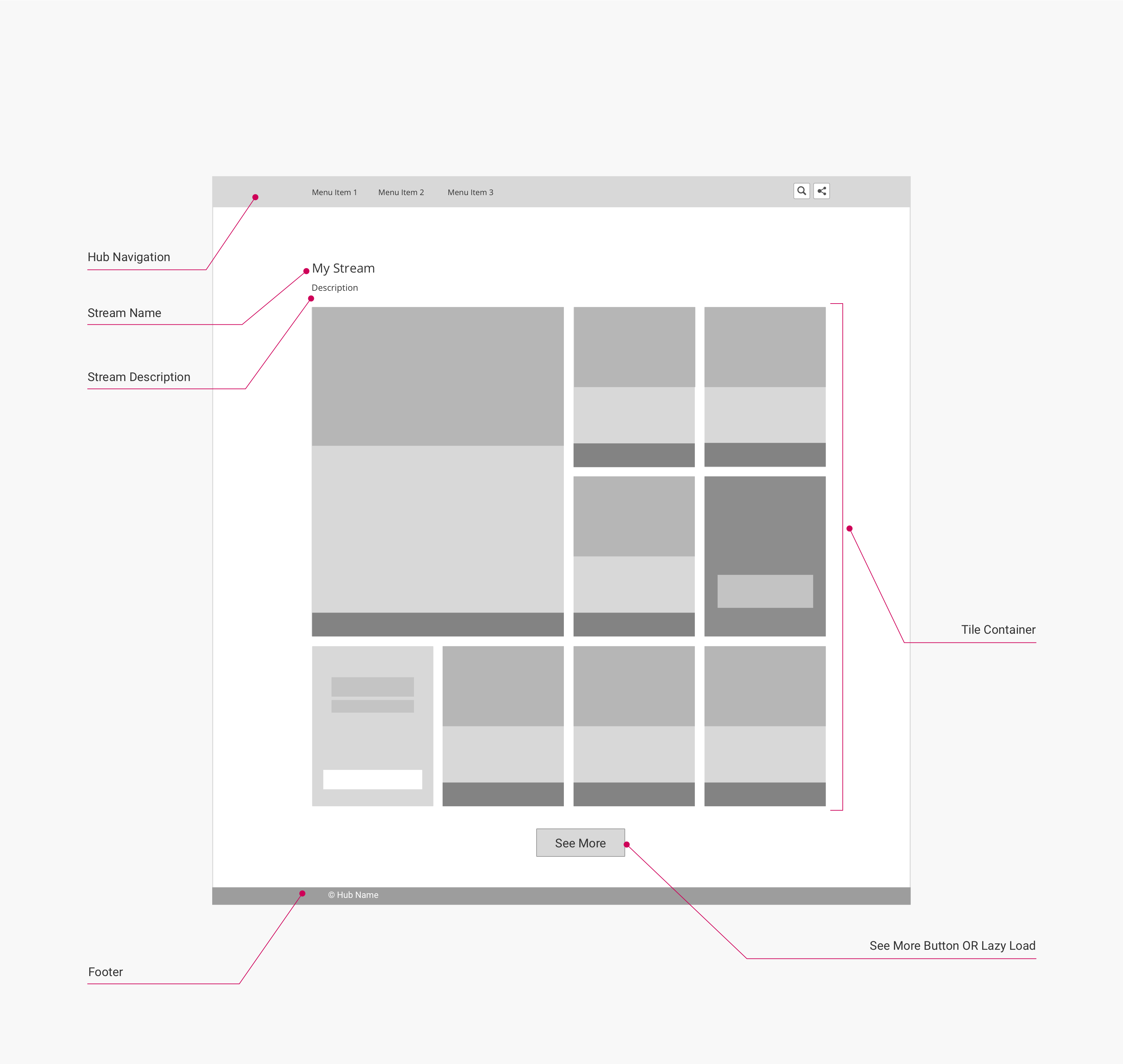
(Click to enlarge)
Mobile layout
This layout is used for viewports 560 px wide or smaller:
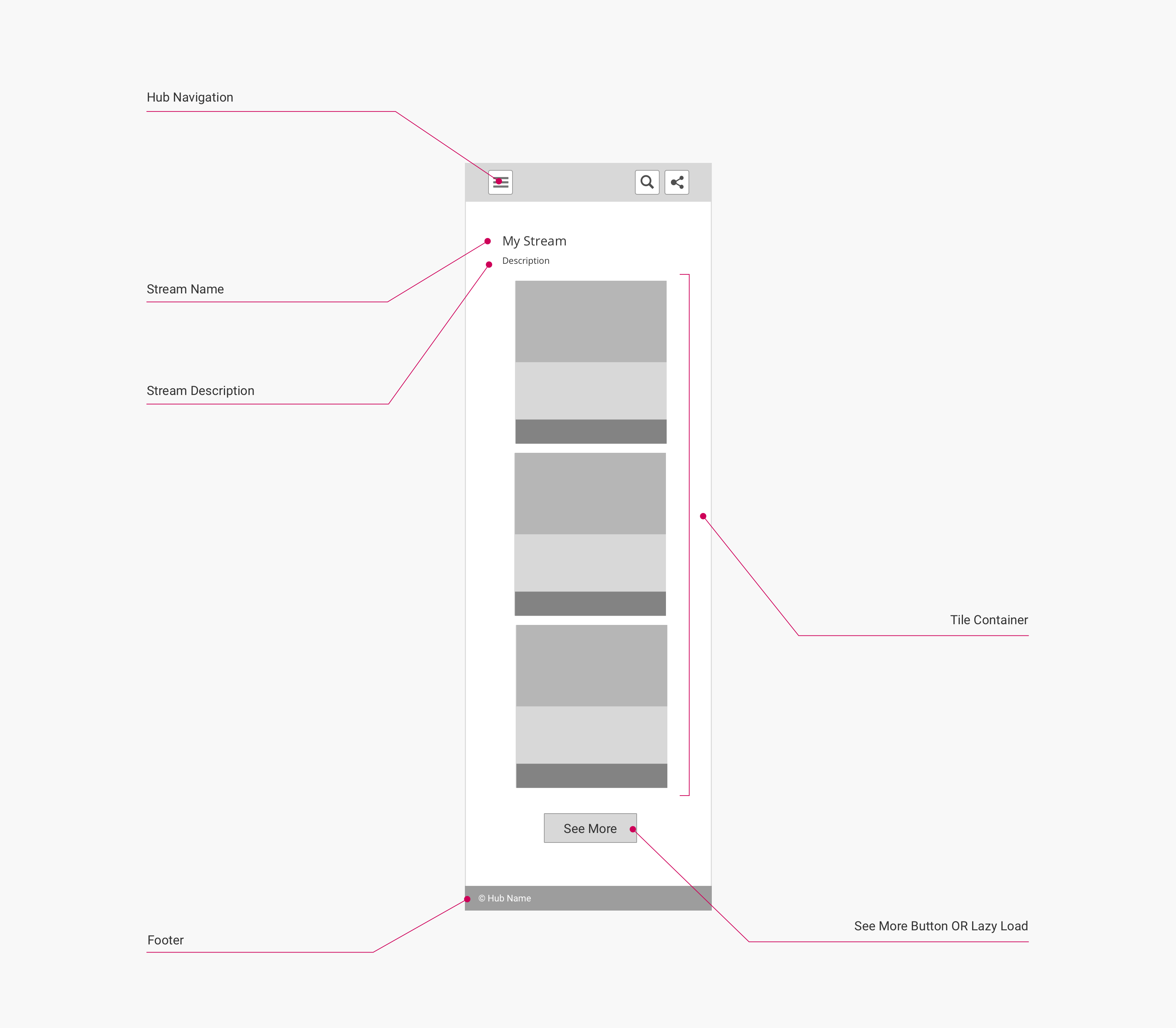
(Click to enlarge)
Page components and CSS selectors
The following table lists the CSS selectors for the labelled page components in the diagrams:
| Page Component | Container CSS Selector | Component CSS Selector | Notes |
|---|---|---|---|
| Hub Navigation | body | .uf-top-nav-container | See Page Component: Hub Navigation for more information. |
| Stream Name | .uf-description-block | .title | |
| Stream Description | .uf-description-block | .subtitle | |
| Tile Container | .uf-lazy-loader | .uf-tile-container | See Page Component: Tile Grid for more information. |
| See More Button | .uf-lazy-loader | .uf-lazy-loader-load-more | Can be hidden and toggled to lazy loading by disabling backend option Hubs > Hub Options > Advanced > Load content by "See more" button. |
| Footer | body | .uf-footer |
Marketing stream page (Banner+Logo template)
The layouts below are used for pages with the Marketing Stream secondary page type when the Banner+Logo template is enabled. This secondary page type/template is used to display a grid of content of mixed types, from one or multiple sources, along with a banner that can be customized/personalized in the hub backend.
Desktop layout
This layout is used for viewports 1337 px wide or larger:
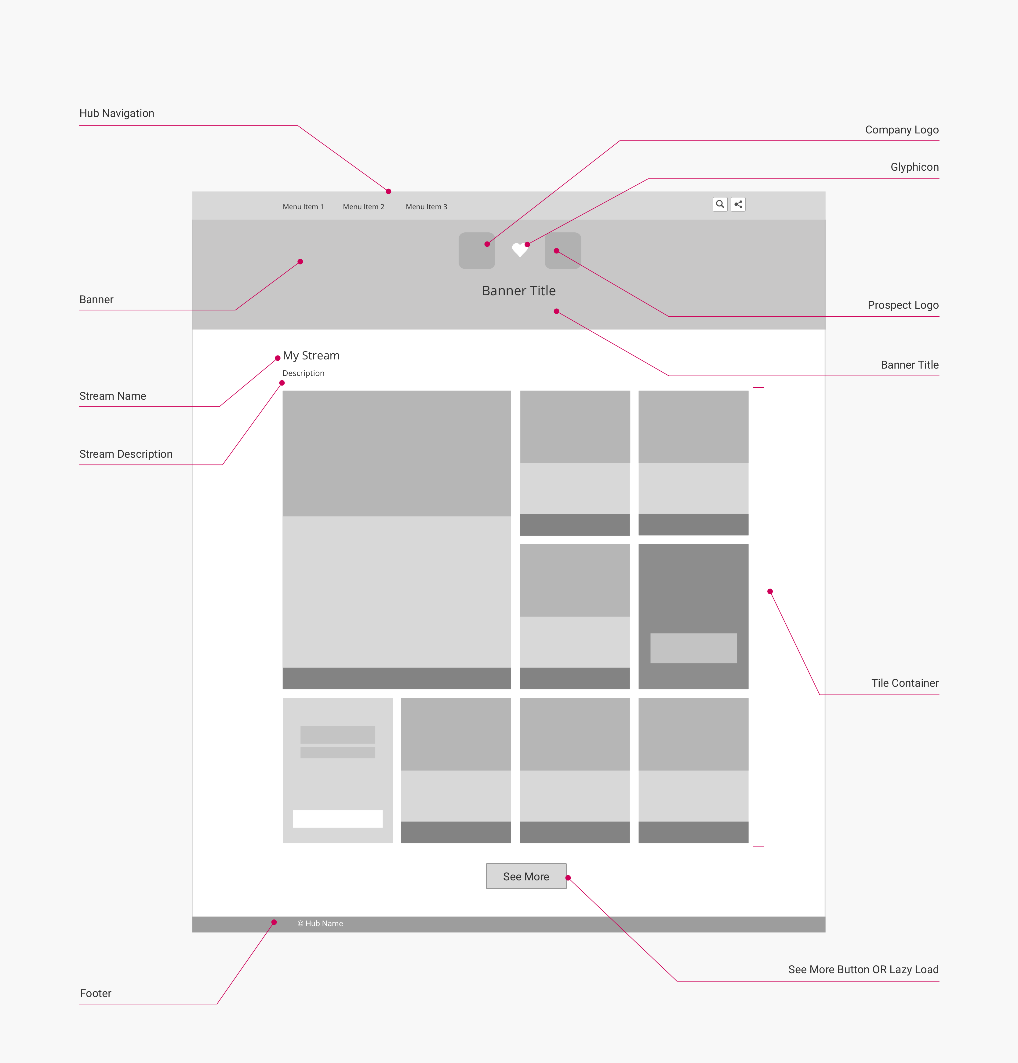
(Click to enlarge)
Note
When the Banner+Logo template is disabled for a Marketing Stream, the stream will use the Default template instead: the layout of this template is effectively identical to the layout of a Source Stream.
Mobile layout
This layout is used or viewports 560 px wide or smaller:
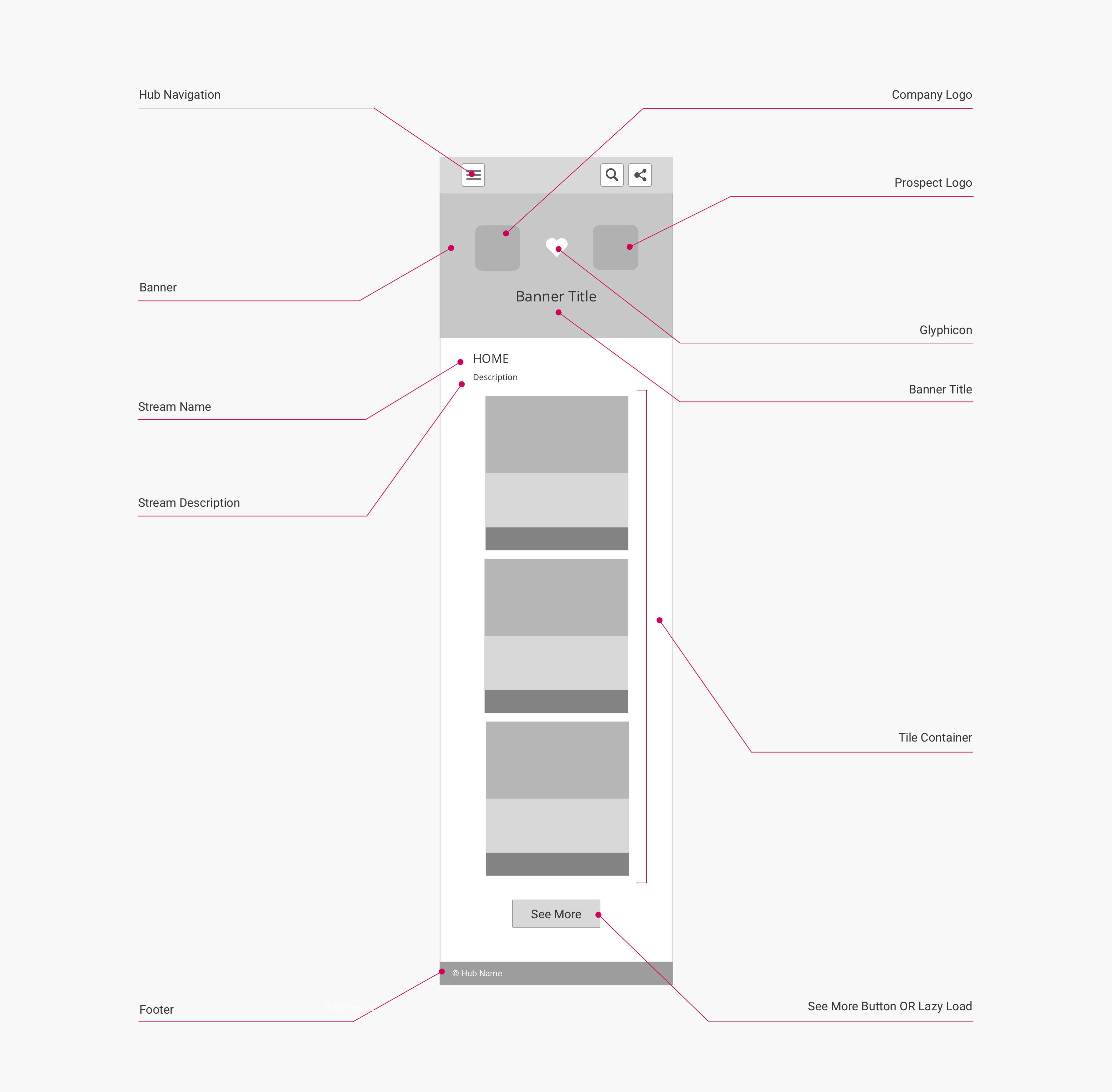
(Click to enlarge)
Page components and CSS selectors
The following table lists the CSS selectors for the labelled page components in the diagrams:
| Page Component | Container CSS Selector | Component CSS Selector | Notes |
|---|---|---|---|
| Hub Navigation | body | .uf-top-nav-container | See Page Component: Hub Navigation for more information. |
| Banner (Color) | body | .hero-template | Part of the Hub Banner page component. Displays a solid color by default, unless a banner image is set. |
| Banner (Image) | .hero-template | .hero-template-overlay | Part of the Hub Banner page component. Displayed on top of the banner color. Only present if a banner image has been set. |
| Company Logo | .hero-template-logo | .uf-company-logo-color | Part of the Hub Banner page component. |
| Glyphicon | div.is-justify-center | .stream-banner-logos-icon | Part of the Hub Banner page component. |
| Prospect Logo | .hero-template-logo | .uf-prospect-logo-color | Part of the Hub Banner page component. |
| Banner Title | .hero-stream-logos | .uf-banner-title-color | Part of the Hub Banner page component. |
| Stream Name | .uf-description-block | .title | |
| Stream Description | uf-description-block | .subtitle | |
| Tile Container | .uf-lazy-loader | .uf-tile-container | See Page Component: Tile Grid for more information. |
| See More Button | .uf-lazy-loader | .uf-lazy-loader-load-more | Can be hidden and toggled to lazy loading by disabling backend option Hubs > Hub Options > Advanced > Load content by "See more" button. |
| Footer | body | .uf-footer |
Hub backend configuration
On the Banner+Logo template layout, users can disable some of the page components listed above on a per-stream basis. This is configured in the Uberflip backend under Hubs > Content > Streams > select Stream > Appearance. The following settings are available:
- Hide Hub Menu and Footer: When enabled, removes the Hub Navigation and Footer components from the DOM.
- Hide Item Navigation: When enabled, removes the Items Carousel/Carousel Header/Carousel Controls, Next Post Flyout, and Previous Post Flyout components from the DOM on item pages within the stream.
- Hide Stream Title: When enabled, removes the Stream Name component from the DOM.
Sales stream page (Banner+Logo template)
The layouts below are used for pages with the Sales Stream secondary page type when the Banner+Logo template is enabled. This secondary page type/template is used to display a grid of content of mixed types, from one or multiple sources, along with a banner that can be customized/personalized in the hub backend.
It is very similar to Marketing Stream Page (Banner+Logo Template), but does not have:
- The hub navigation component, as Sales Streams are intended as standalone experiences separate from the rest of the hub.
- The see more/lazy load component, as Sales Streams are limited to 20 content items.
Desktop layout
This layout is used for viewports 1337 px wide or larger:
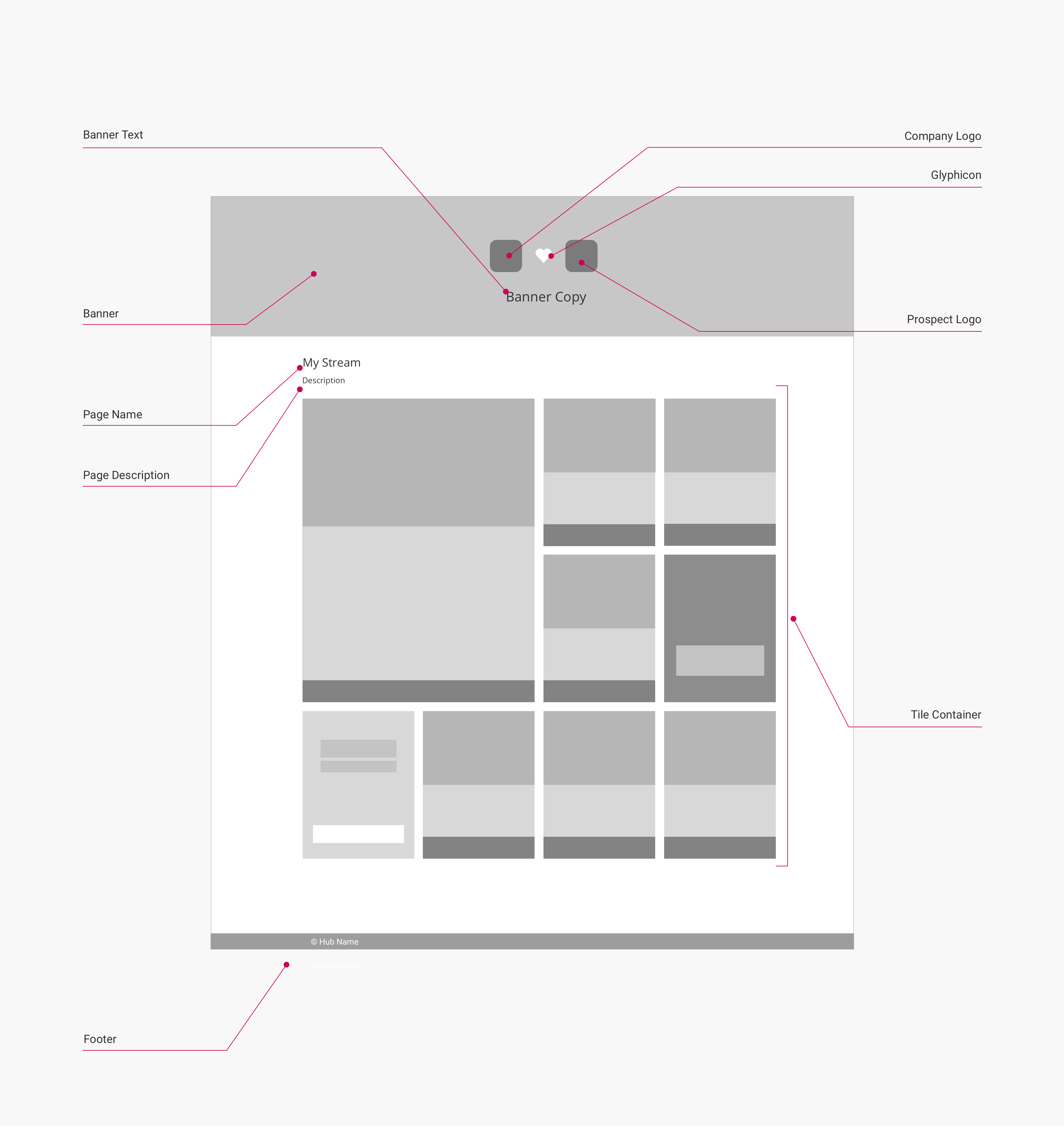
(Click to enlarge)
Note
When the Banner+Logo template is disabled for a Sales Stream, the stream will use the Default template instead: the layout of this template is effectively identical to the layout of a Source Stream, with the following differences:
- The Hub Navigation component is removed
- A User Avatar component (consisting of a
<figure>element with the classuf-avatar) is placed to the left of the Stream Name and Stream Description components
Mobile layout
This layout is used for viewports 560 px wide or smaller:
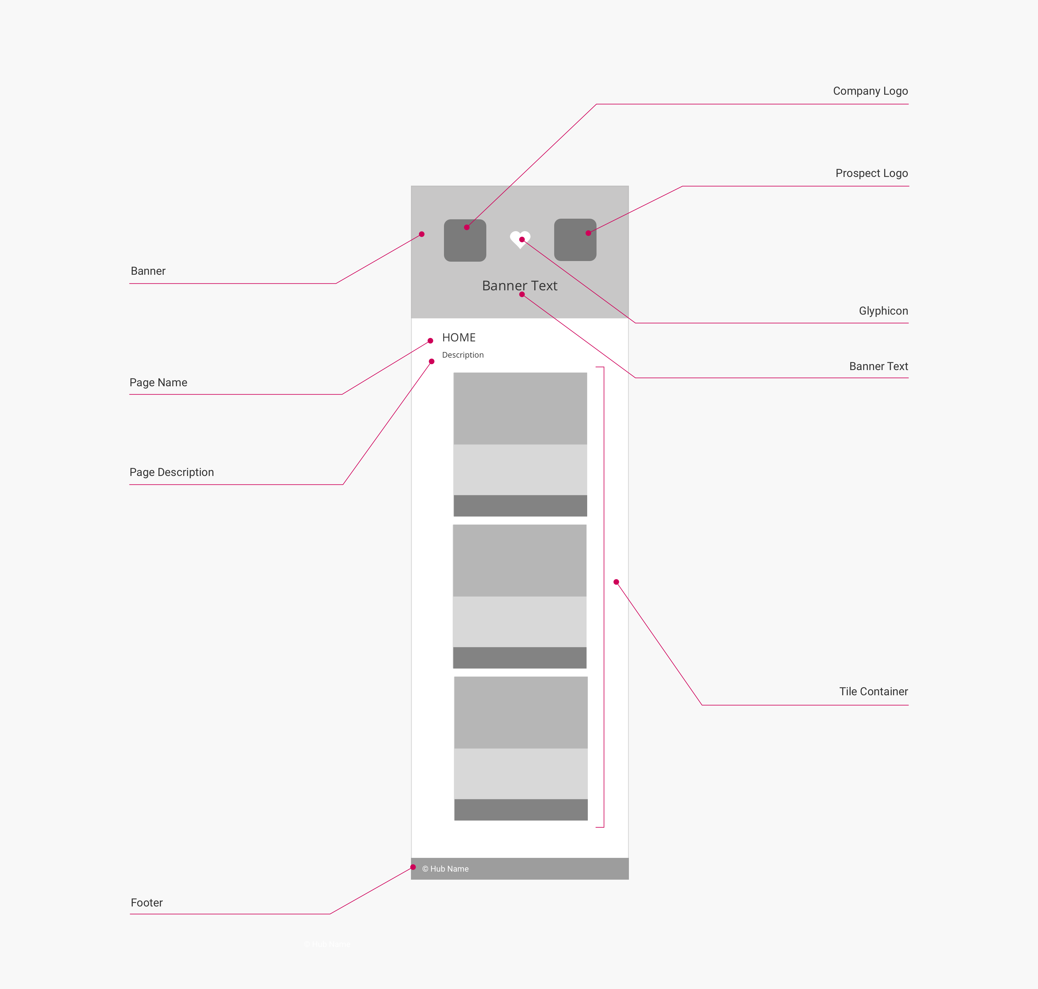
(Click to enlarge)
Page components and CSS selectors
The following table lists the CSS selectors for the labelled page components in the diagrams:
| Page Component | CSS Selector | Notes | |
|---|---|---|---|
| Banner (Color) | body | .hero-template | Part of the Hub Banner page component. Displays a solid color by default, unless a banner image is set. |
| Banner (Image) | .hero-template | .hero-template-overlay | Part of the Hub Banner page component. Displayed on top of the banner color. Only present if a banner image has been set. |
| Company Logo | .hero-template-logo | .uf-company-logo-color | Part of the Hub Banner page component. |
| Glyphicon | div.is-justify-center | .stream-banner-logos-icon | Part of the Hub Banner page component. |
| Prospect Logo | .hero-template-logo | .uf-prospect-logo-color | Part of the Hub Banner page component. |
| Banner Title | .hero-stream-logos | .uf-banner-title-color | Part of the Hub Banner page component. |
| Stream Name | .uf-description-block | .title | |
| Stream Description | .uf-description-block | .subtitle | |
| Tile Container | .uf-lazy-loader | .uf-tile-container | See Page Component: Tile Grid for more information. |
| Footer | body | .uf-footer |
Hub backend configuration
On the Banner+Logo template layout, users can disable some of the page components listed above on a per-stream basis. This is configured in the Uberflip backend under Hubs > Content > Streams > select Stream > Appearance. The following settings are available:
- Hide Stream Title: When enabled, removes the Stream Name component from the DOM.
Updated over 5 years ago
