Page layout: Item pages
A reference guide to the item page page types and their page elements
This reference guide describes the layout and composition of pages with the item page page type (including all variants).
Usage
Use this guide to understand which components are used on pages with this page type, how they are laid out, and how to target them for customization.
The diagrams in this guide are representative of the out-of-the-box layouts of pages with variants of this page type. Each diagram is annotated with the page components that are present on the indicated page type variant (or which may be present, depending on backend settings).
For each page component, the relevant CSS selectors (for both the component itself, and its container) are provided. Wherever a page component is part of a larger page component that has its own reference guide, this is also indicated.
About this Page Type
The purpose of the item page page type is to allow visitors to a hub front end to consume content. As a hub can contain multiple different types of content/media, there are multiple variations of this page type, known as secondary page types. All share similar layouts, and differ primarily in the structure of their main content wrapper, which contains the primary content displayed on the page.
All secondary page types share the same main content wrapper structure. The primary main content wrapper has the class uf-item-content, and nested within are further wrappers, as follows:
uf-item-contentuf-main-contentuf-articleuf-item-entry-content
The lowest child class, uf-item-entry-content, has an additional child class which is specific to the type (and source) of content displayed. This content-specific class is indicated for each of the secondary page types below, under the Post Content component.
Item Page Source Code
When editing an item page in the Uberflip backend, users have the ability to directly view and modify the HTML of the content-specific class within the
uf-item-entry-contentwrapper by using the Source Code option in the editor.
Note
Most pages in the hub front end have a
containerclass that is applied to component containers that are centered on the page, and which is used to set their default width. On the item page page types, thecontainerclass is applied to the following components:
- Hub Navigation
- The
divelement with theidofuf-item-container(the container for the main content wrapper)- Footer
You can adjust the default widths of the
containerclass to adjust the widths of these page components.
Item page: Blogpost
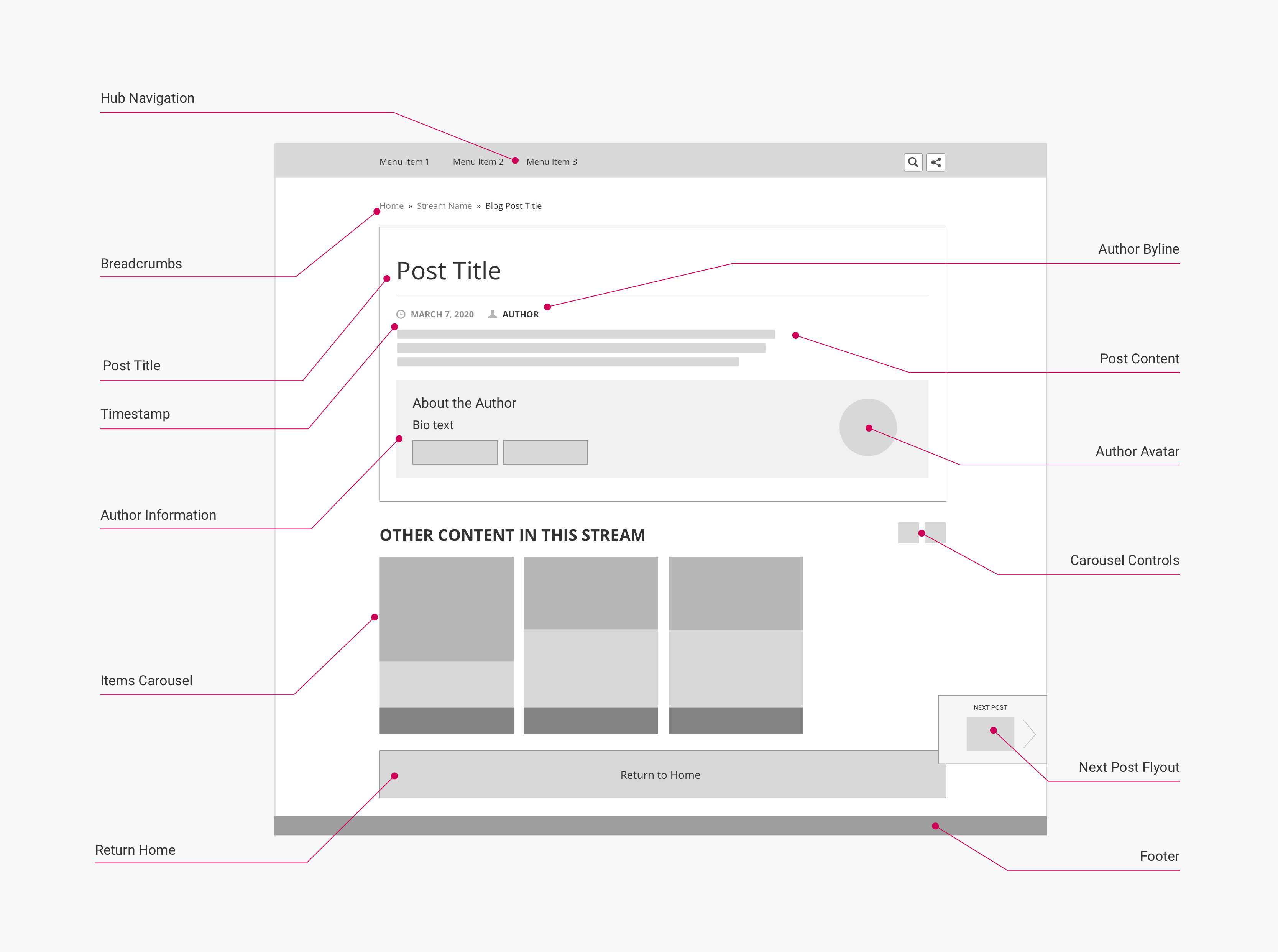
The layout below is used for pages with the Blogpost secondary page type. This secondary page type is used to display blog article content.
Layout
(Click to enlarge)
Page components and CSS selectors
The following table lists the CSS selectors for the labelled page components in the diagram:
| Page Component | Container CSS Selector | Component CSS Selector | Notes |
|---|---|---|---|
| Hub Navigation | body | .uf-top-nav-container | See Page Component: Hub Navigation for more information. |
| Breadcrumbs | .uf-breadcrumbs-container | .uf-breadcrumbs | See Page Component: Breadcrumbs for more information. |
| Post Title | .uf-article-header | .title | |
| Timestamp | .uf-meta-data | .uf-datetime | Displays the date the content was published. |
| Author Byline | .uf-meta-data | .uf-author | Displays the author name, if one has been set for the content. If the author has filled in a bio, this is a hyperlink to their author page. |
| Post Content | .uf-item-entry-content | .uf-item-blog-content | |
| Author Information | .uf-article | .uf-author-profile | Only displayed if an author has been set for the content, and the author has filled in a bio. |
| Author Avatar | .uf-author-about | .uf-author-avatar | Only displayed if the Author Information box is shown, and the author has uploaded a profile picture. |
| Show Beside CTA [not shown] | .uf-cta-beside | .uf-cta-title | A Form or Link CTA tile displayed to the right of the main content wrapper. See Page Component: Tile Grid for more information. |
| Gated CTA [not shown] | .uf-gated-cta-wrapper | .uf-cta-form-cta-tile.uf-gated-cta | A Form CTA tile displayed on top of the main content wrapper, "gating" it. See Page Component: Tile Grid for more information. |
| Recommendations Panel [not shown] | .uf-item-aside | .uf-reco-panel | A sidebar fixed to the left of the main content area that displays tiles of recommended content items. Only shown if the Content Recommendations feature is enabled. |
| Items Carousel | .uf-item-aside | .uf-slider | A carousel of recent/related content (depending on hub settings). |
| Carousel Header | .uf-slider-header | .uf-slider-title | |
| Carousel Controls | .uf-slider-controls.uf-slider.nav | .uf-slider-next / .uf-slider-previous | Next/previous buttons for paging through the items in the carousel. |
| Next Post Flyout | .uf-next-item | .uf-next-link | |
| Previous Post Flyout [not shown] | .uf-prev-item | .uf-prev-link | |
| Return Home | .uf-item-content | .uf-return-home | Links back to the hub page. |
| Footer | body | .uf-footer |
Item Page: Document
The layouts below are used for pages with the Document secondary page type. This includes the following tertiary page types:
- Uberflip (Flipbook)
- Slideshare
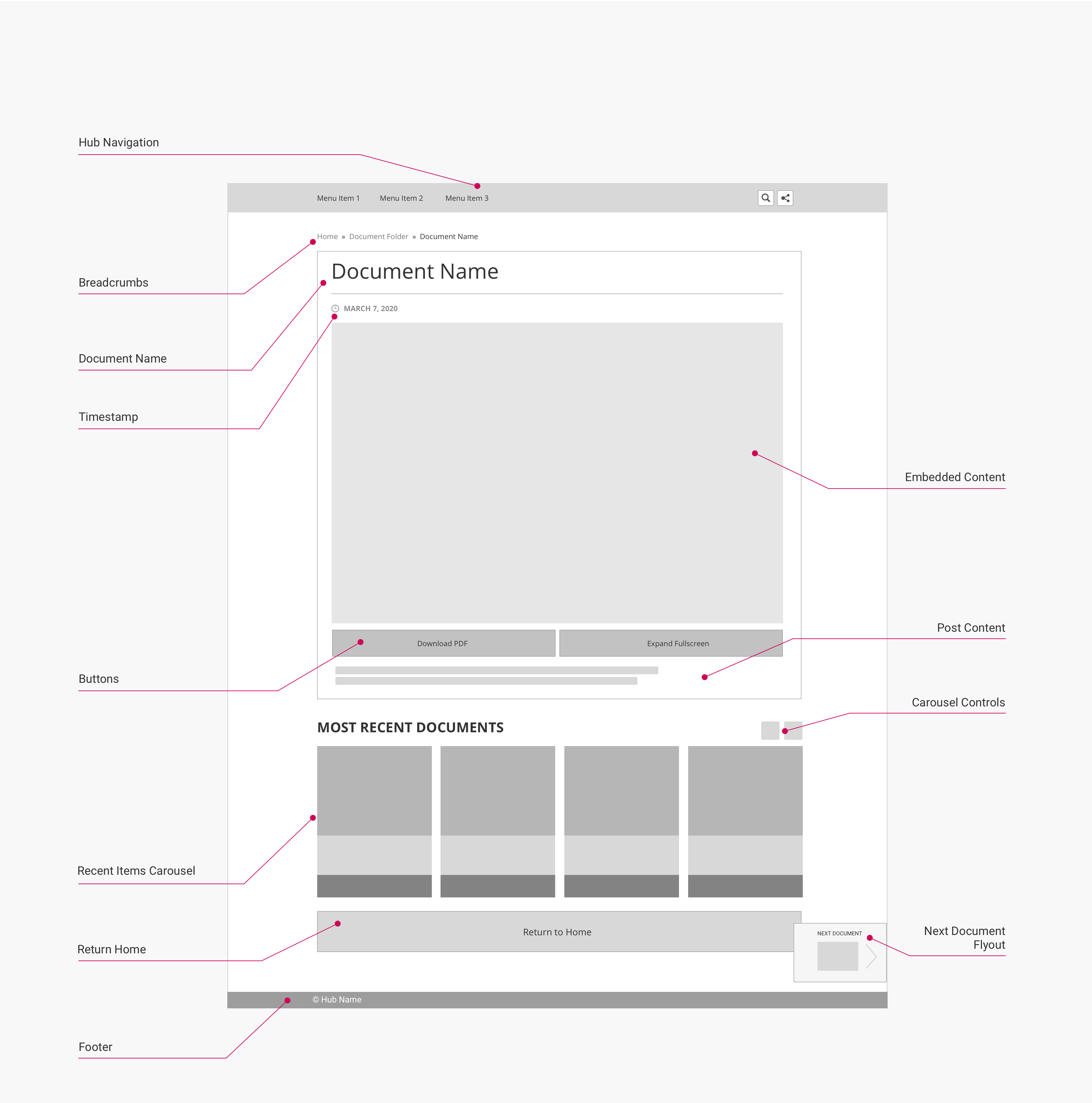
This secondary page type is used to display document content. This may either be a PDF document (e.g. an ebook) displayed as an Uberflip Flipbook or a native PDF, or a SlideShare deck. In all cases, the document is displayed in an iframe within the uf-item-entry-content wrapper.
Desktop layout
This layout is used for viewports 1337 px wide or larger:
(Click to enlarge)
Mobile layout
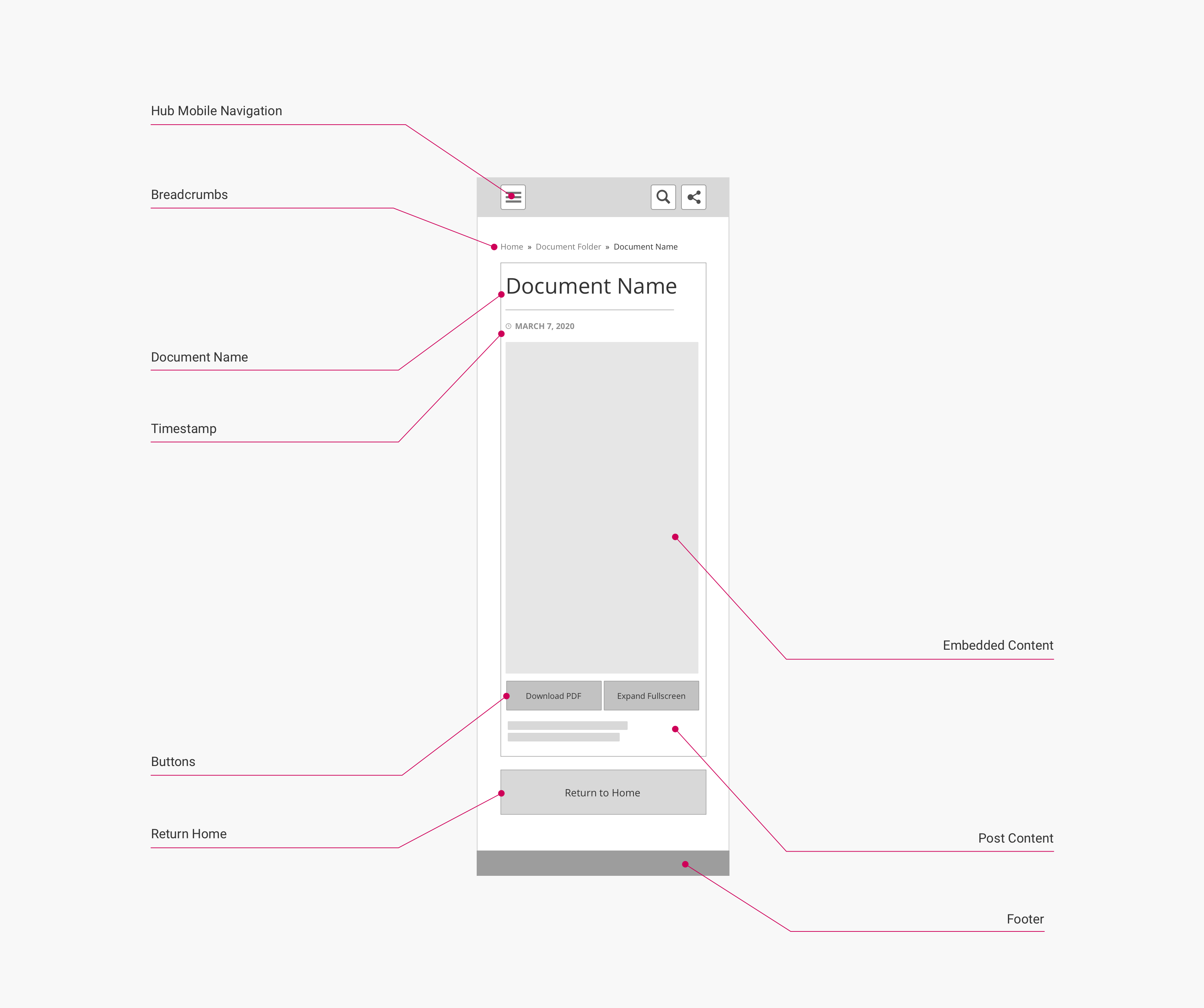
This layout is used for viewports 560 px wide or smaller:
(Click to enlarge)
Page components and CSS selectors
The following table lists the CSS selectors for the labelled page components in the diagram:
| Page Component | Container CSS Selector | Component CSS Selector | Notes |
|---|---|---|---|
| Hub Navigation | body | .uf-top-nav-container | See Page Component: Hub Navigation for more information. |
| Breadcrumbs | .uf-breadcrumbs-container | .uf-breadcrumbs | See Page Component: Breadcrumbs for more information. |
| Document Name | .uf-article-header | .title | |
| Timestamp | .uf-meta-data | .uf-datetime | Displays the date the content was published. |
| Author Byline [not shown] | .uf-meta-data | .uf-author | Displays the author name, if one has been set for the content. If the author has filled in a bio, this is a hyperlink to their author page. |
| Embedded Content | .uf-item-entry-content | .uf-flipbook-wrapper | Contains the embedded content in an iframe. |
| Buttons | .uf-flipbook | .uf-flipbook-controls | Used for additional document control options. |
| Post Content | .uf-item-entry-content | .uf-item-blog-content | Displays (optional) blog article content. |
| Author Information [not shown] | .uf-article | .uf-author-profile | Only displayed if an author has been set for the content, and the author has filled in a bio. |
| Author Avatar [not shown] | .uf-author-about | .uf-author-avatar | Only displayed if the Author Information box is shown, and the author has uploaded a profile picture. |
| Show Beside CTA [not shown] | .uf-cta-beside | .uf-cta-title | A Form or Link CTA tile displayed to the right of the main content wrapper. See Page Component: Tile Grid for more information. |
| Gated CTA [not shown] | .uf-gated-cta-wrapper | .uf-cta-form-cta-tile.uf-gated-cta | A Form CTA tile displayed on top of the main content wrapper, "gating" it. See Page Component: Tile Grid for more information. |
| Recommendations Panel [not shown] | .uf-item-aside | .uf-reco-panel | A sidebar fixed to the left of the main content area that displays tiles of recommended content items. Only shown if the Content Recommendations feature is enabled. |
| Items Carousel | .uf-item-aside | .uf-slider | A carousel of recent/related content (depending on hub settings). |
| Carousel Header | .uf-slider-header | .uf-slider-title | |
| Carousel Controls | .uf-slider-controls.uf-slider.nav | .uf-slider-next / .uf-slider-previous | Next/previous buttons for paging through the items in the carousel. |
| Next Post Flyout | .uf-next-item | .uf-next-link | |
| Previous Post Flyout [not shown] | .uf-prev-item | .uf-prev-link | |
| Return Home | .uf-item-content | .uf-return-home | Links back to the hub page. |
| Footer | body | .uf-footer |
Note
The contents of an iframe cannot be styled directly with CSS. However, you can modify the height, width and layout of the iframe container itself.
In addition, if the iframe contains the Uberflip Flipbook viewer, you can modify various appearance options for the Flipbook viewer in the Uberflip backend under Flipbooks > Manage Flipbooks > Folder Options > Edit > Appearance & Branding.
Item Page: Video
The layout below is used for pages with the Video secondary page type. This includes the following tertiary page types:
- Brightcove
- Vidyard
- Vimeo
- Wistia
- YouTube
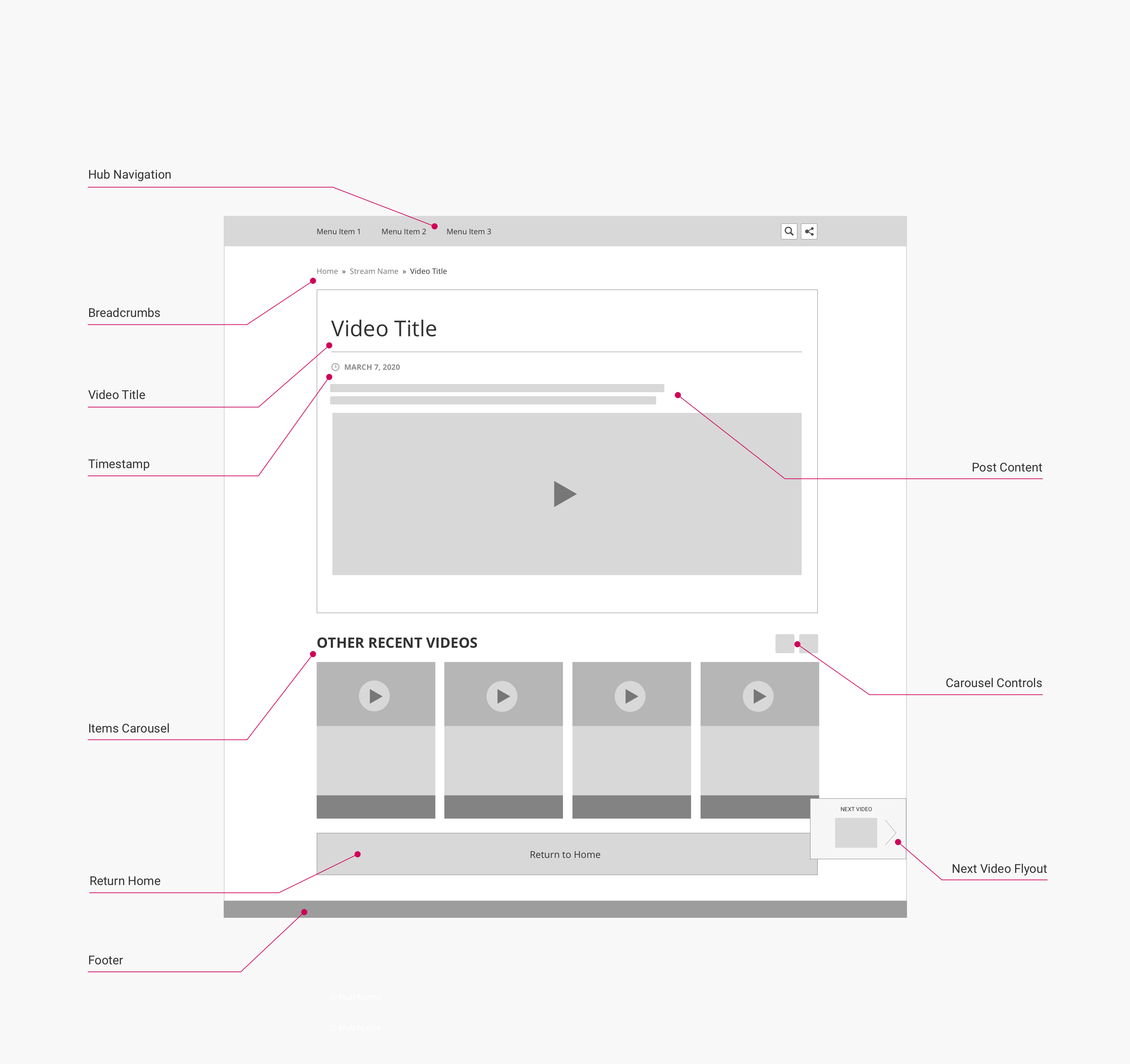
This secondary page is used to display video content. Uberflip does not host video, so all video content must be served from an external host, and is displayed on the item page in an iframe within the uf-item-entry-content wrapper.
Layout
(Click to enlarge)
Page components and CSS selectors
The following table lists the CSS selectors for the labelled page components in the diagram:
| Page Component | Container CSS Selector | Component CSS Selector | Notes |
|---|---|---|---|
| Hub Navigation | body | .uf-top-nav-container | See Page Component: Hub Navigation for more information. |
| Breadcrumbs | .uf-breadcrumbs-container | .uf-breadcrumbs | See Page Component: Breadcrumbs for more information. |
| Video Title | .uf-article-header | .title | |
| Timestamp | .uf-meta-data | .uf-datetime | Displays the date the content was published. |
| Author Byline [not shown] | .uf-meta-data | .uf-author | Displays the author name, if one has been set for the content. If the author has filled in a bio, this is a hyperlink to their author page. |
| Post Content | .uf-item-entry-content | .uf-video-content.uf-[videohost]-content | Displays (optional) blog article content. The class uf-[videohost]-content is specific to the host of the embedded video, and [videohost] may be any of: brightcove, vidyard, vimeo, wistiar, youtube. |
| Embedded Content | .uf-item-entry-content | .uf-video-wrapper | Contains the embedded video in an iframe. |
| Author Information [not shown] | .uf-article | .uf-author-profile | Only displayed if an author has been set for the content, and the author has filled in a bio. |
| Author Avatar [not shown] | .uf-author-about | .uf-author-avatar | Only displayed if the Author Information box is shown, and the author has uploaded a profile picture. |
| Show Beside CTA [not shown] | .uf-cta-beside | .uf-cta-title | A Form or Link CTA tile displayed to the right of the main content wrapper. See Page Component: Tile Grid for more information. |
| Gated CTA [not shown] | .uf-gated-cta-wrapper | .uf-cta-form-cta-tile.uf-gated-cta | A Form CTA tile displayed on top of the main content wrapper, "gating" it. See Page Component: Tile Grid for more information. |
| Recommendations Panel [not shown] | .uf-item-aside | .uf-reco-panel | A sidebar fixed to the left of the main content area that displays tiles of recommended content items. Only shown if the Content Recommendations feature is enabled. |
| Items Carousel | .uf-item-aside | .uf-slider | A carousel of recent/related content (depending on hub settings). |
| Carousel Header | .uf-slider-header | .uf-slider-title | |
| Carousel Controls | .uf-slider-controls.uf-slider.nav | .uf-slider-next / .uf-slider-previous | Next/previous buttons for paging through the items in the carousel. |
| Next Post Flyout | .uf-next-item | .uf-next-link | |
| Previous Post Flyout [not shown] | .uf-prev-item | .uf-prev-link | |
| Return Home | .uf-item-content | .uf-return-home | Links back to the hub page. |
| Footer | body | .uf-footer |
Note
The contents of an iframe cannot be styled directly with CSS. However, you can modify the height, width and layout of the iframe container itself.
Item Page: Social
The layout below is used for pages with the Social secondary page type. This includes the following tertiary page types:
This secondary page type is used to display social media content. In all cases, a single post from the relevant social network is embedded on the item page within the uf-item-entry-content class.
Layout
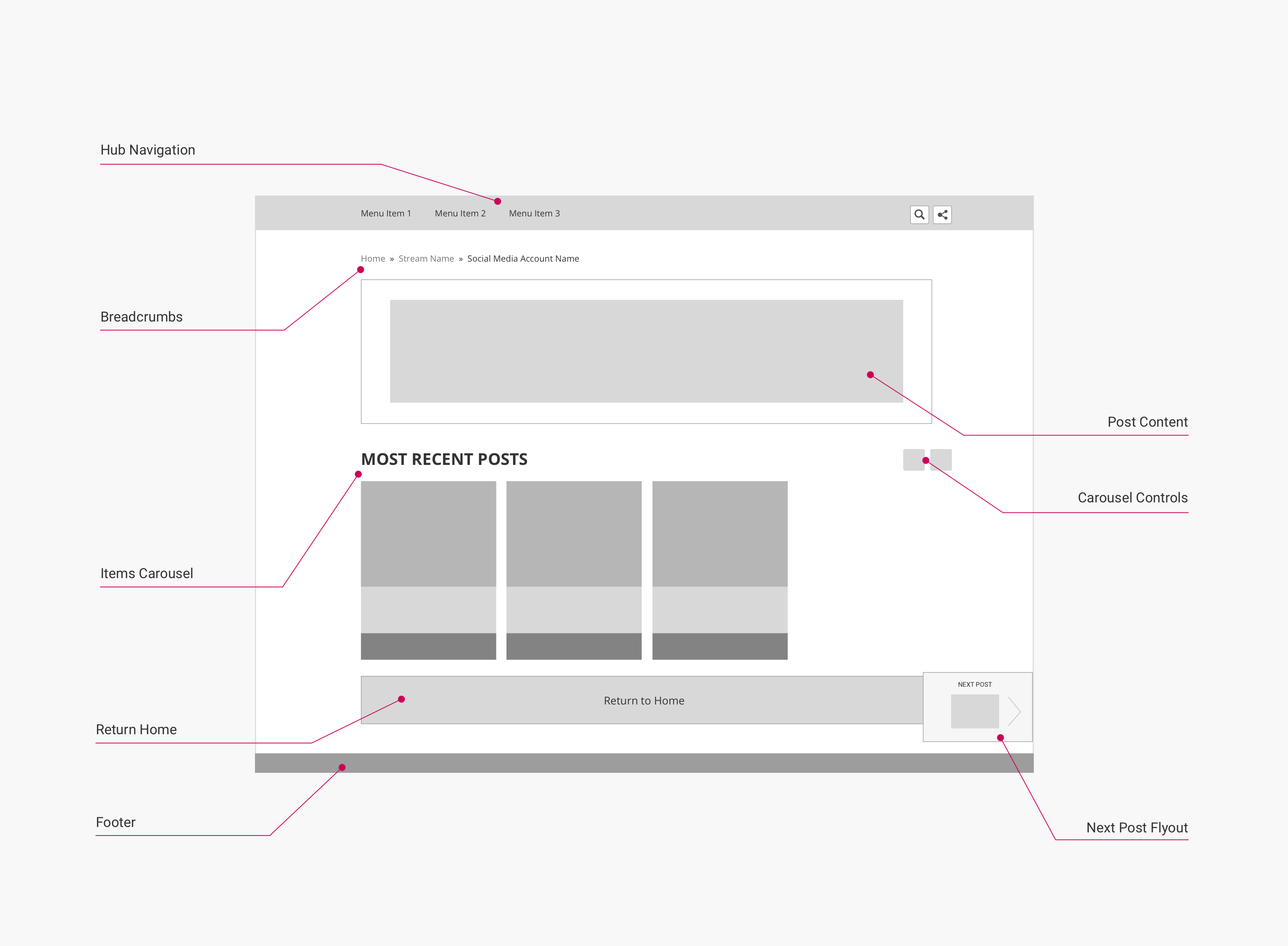
(Click to enlarge)
Page components and CSS selectors
The following table lists the CSS selectors for the labelled page components in the diagram:
| Page Component | Container CSS Selector | Component CSS Selector | Notes |
|---|---|---|---|
| Hub Navigation | body | .uf-top-nav-container | See Page Component: Hub Navigation for more information. |
| Breadcrumbs | .uf-breadcrumbs-container | .uf-breadcrumbs | See Page Component: Breadcrumbs for more information. |
| Social Header | .uf-item-entry-content | .uf-social-header | Displays the handle of the social media account. |
| Embedded Content | .uf-item-entry-content | .uf-twitter-content | Contains the embedded social content. |
| Social Footer | .uf-item-entry-content | .uf-twitter-footer | Contains buttons to interact with the post and statistics. |
| Show Beside CTA [not shown] | .uf-cta-beside | .uf-cta-title | A Form or Link CTA tile displayed to the right of the main content wrapper. See Page Component: Tile Grid for more information. |
| Gated CTA [not shown] | .uf-gated-cta-wrapper | .uf-cta-form-cta-tile.uf-gated-cta | A Form CTA tile displayed on top of the main content wrapper, "gating" it. See Page Component: Tile Grid for more information. |
| Recommendations Panel [not shown] | .uf-item-aside | .uf-reco-panel | A sidebar fixed to the left of the main content area that displays tiles of recommended content items. Only shown if the Content Recommendations feature is enabled. |
| Items Carousel | .uf-item-aside | .uf-slider | A carousel of recent/related content (depending on hub settings). |
| Carousel Header | .uf-slider-header | .uf-slider-title | A carousel of recent/related content (depending on hub settings). |
| Carousel Controls | .uf-slider-controls.uf-slider.nav | .uf-slider-next / .uf-slider-previous | Next/previous buttons for paging through the items in the carousel. |
| Next Post Flyout | .uf-next-item | .uf-next-link | |
| Previous Post Flyout [not shown] | .uf-prev-item | .uf-prev-link | |
| Return Home | .uf-item-content | .uf-return-home | Links back to the hub page. |
| Footer | body | .uf-footer |
Updated over 5 years ago
