Page layout: Hub page
A reference guide to the hub page page type and its page components
This reference guide describes the layout and composition of pages with the hub page page type.
Usage
Use this guide to understand which components are used on pages with this page type, how they are laid out, and how to target them for customization.
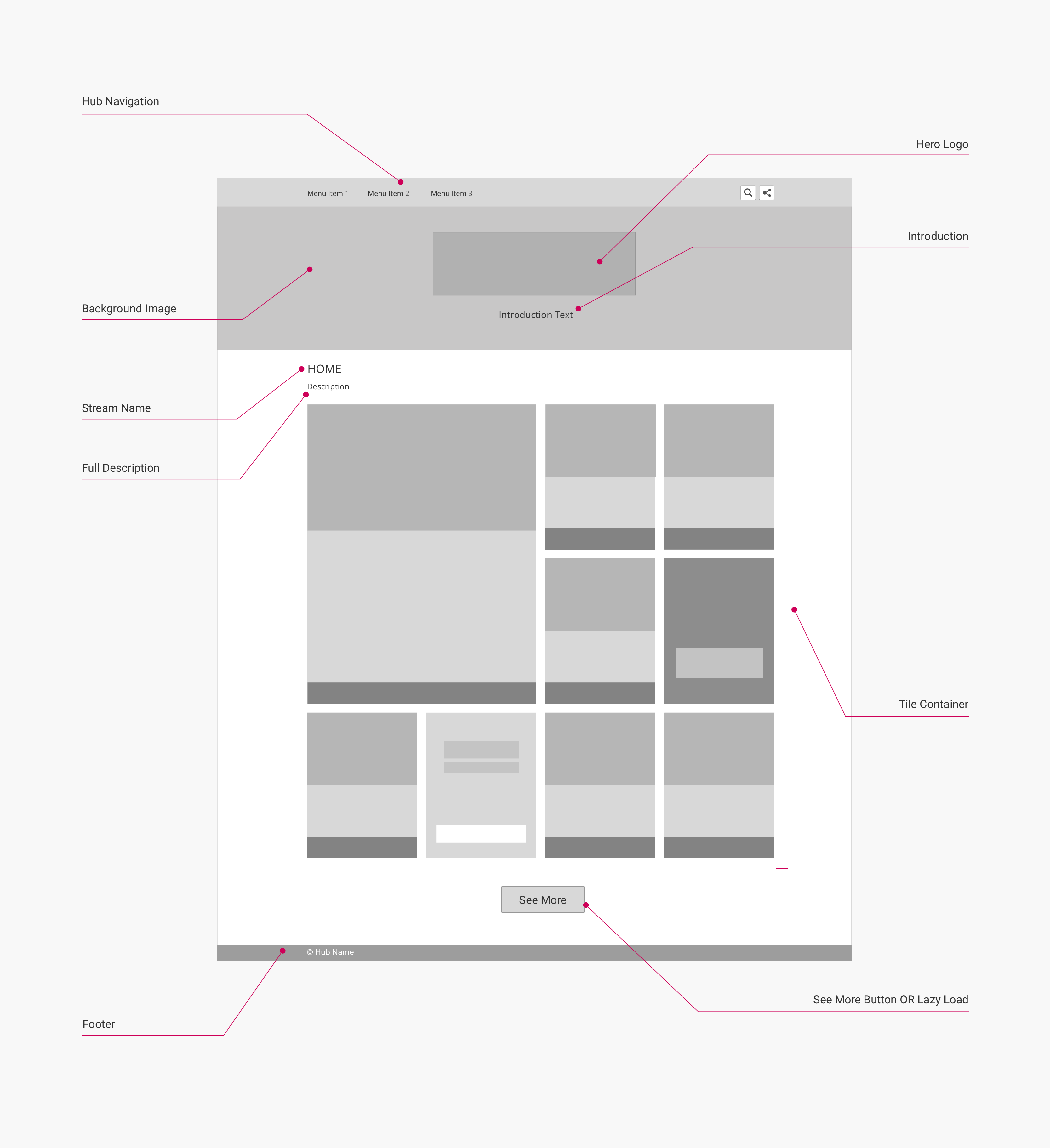
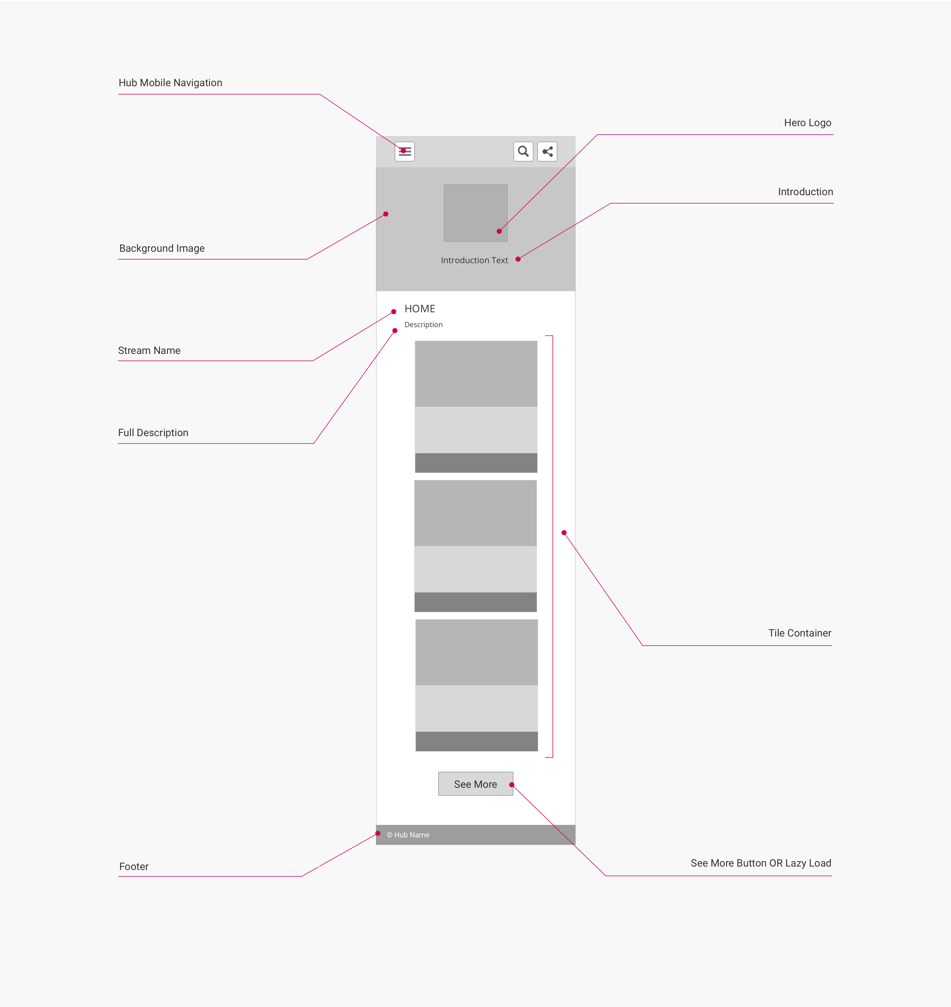
The diagrams in this guide are representative of the out-of-the-box layouts of pages with this page type. Each diagram is annotated with the page components that are present on this page type (or which may be present, depending on backend settings).
For each page component, the relevant CSS selectors (for both the component itself, and its container) are provided. Wherever a page component is part of a larger page component that has its own reference guide, this is also indicated.
About this Page Type
The purpose of the hub page page type is to act as the home page of a hub front end. As a result, each hub front end contains only one page with this page type.
This page type is structurally similar to the stream page page type: both of these page types are designed to display content in a browseable grid, so the tile grid page component is a prominent part of their layout.
This page type also includes a unique page component that is not present on any other page type, the hub banner (although the stream page page type has a closely related and very similar component, the stream banner).
Hub page
This page type is used to display a banner representing the hub/brand, as well as a grid of content. By default, this content is the most recently created content in the hub ("Latest Content"), but it can also be the content from any marketing stream if configured as such in the hub backend.
Desktop layout
This layout is used for viewports 1337 px wide or larger:

(Click to enlarge)
Mobile layout
This layout is used for viewports 560 px wide or smaller:

(Click to enlarge)
Page components and CSS selectors
The following table lists the CSS selectors for the labelled page components in the diagrams:
| Page Component | Container CSS Selector | Component CSS Selector | Notes |
|---|---|---|---|
| Hub Navigation | body | .uf-top-nav-container | See Page Component: Hub Navigation for more information. |
| Hero Logo | .hero-body.container | .hero-logo | Part of the Hub Banner page component. |
| Background Image | body | .uf-hero-header | Part of the Hub Banner page component. |
| Introduction | .hero-body.container | .subtitle | Part of the Hub Banner page component. |
| Stream Name | .uf-description-block | .title | Displays Latest Content by default. |
| Full Description | .uf-description-block | .subtitle | |
| Tile Container | body | .uf-main-content.container | See Page Component: Tile Grid for more information. |
| See More Button | .uf-lazy-loader | .uf-lazy-loader-load-more | Can be hidden and toggled to lazy loading by disabling backend option Hubs > Hub Options > Advanced > Load content by "See more" button |
| Footer | body | .uf-footer |
Note
Most pages in the hub front end have a
containerclass that is applied to component containers that are centered on the page, and which is used to set their default width. On the hub page page type, thecontainerclass is applied to the following components:
- Hub Navigation
- Tile Container
- Footer
You can adjust the default widths of the
containerclass to adjust the widths of these page components.
Updated over 5 years ago
