Page component: Item tiles and CTA tiles
A reference guide to the tile components that appear on the majority of hub front end pages
This reference guide describes the individual tile components that appear across the hub front end on stream pages and the hub home page (as part of the tile grid), as well as on item pages.
Usage
Use this guide to understand how this component works, how its individual elements are structured, and how to target them for customization.
The diagrams in this guide are representative of the out-of-the-box appearance of the item tile and CTA tile page component in their various states. Each diagram is annotated with the constituent elements of this page component, as well as the relevant CSS selectors (for both the element itself, and its container).
About Item tiles and CTA tiles
Tiles are a fundamental component in the hub front end. They are essentially "cards": rectangular visual elements consisting of text overlaid on a background (typically an image, but sometimes a solid color). All tiles are interactive in some way: most act as hyperlinks to item pages or custom destinations, while some are self-contained forms.
The primary purpose of tiles is to act as visual representations of the content available in a hub, in order to make that content easy and attractive to browse. They also serve the secondary purpose of allowing for "call-to-action" elements that integrate seamlessly with the content tiles.
There are three types of tiles:
- Item tiles: These tiles represent individual pieces of content, and act as hyperlinks to the item pages where that content can be consumed.
- Link CTA tiles: These call-to-action tiles encourage visitors to click a link. Like item tiles they act as hyperlinks, but to a user-configurable destination rather than a fixed item page.
- Form CTA tiles: These call-to-action tiles encourage visitors to fill out and submit a form. The tile itself contains this form, which collects visitor information for a connected marketing automation platform.
Item tiles
Item tiles act as the links to item pages in the hub front end. The basic layout of an item tile consists of a thumbnail image, a title and brief description of the content, and a small "content label" element that describes the type of content with a call to action (i.e. "watch video", "read article", etc.). Item tiles have two states: Static and Hover.
Locations
Item tiles can be found on pages with the hub page,stream page, and item page page types.
Hub and stream page types
On the hub page and stream pages, item tiles are displayed exclusively within the tile grid component.
Item page types
On item pages, item tiles appear as part of the following page components:
| Page Component | Location on Page | Container CSS Selector | Notes |
|---|---|---|---|
| Items Carousel | Near bottom of page (carousel element) | div#uf-slider-track > ul#uf-slider-tiles-list | Displays tiles for recent/related content items |
| Recommendations Panel | Attached to left side of page (panel element) | aside#uf-reco-panel > ul#uf-reco-tiles-list | Only shown if the Content Recommendations feature is enabled. |
Layout: Static state
This is the default state of the item tile component after it is loaded on a page.
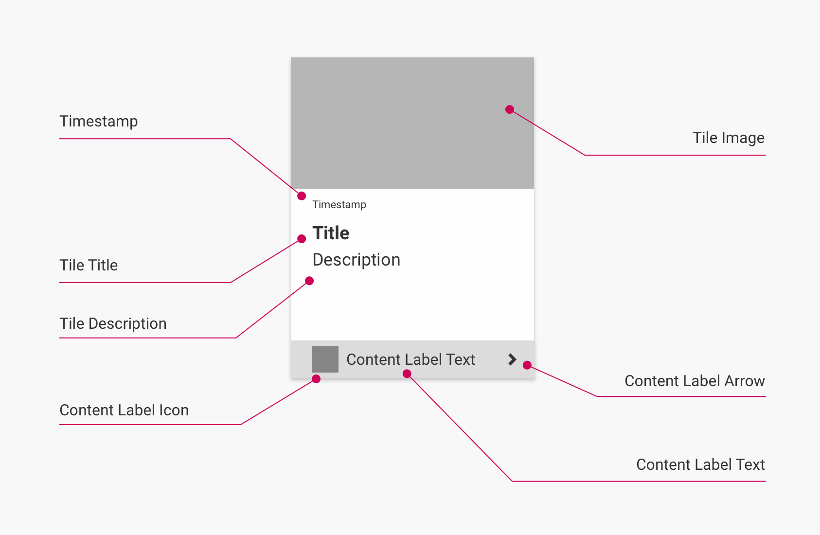
(Click to enlarge)
Layout: Hover state
This state occurs when hovering on an item tile. By default, this adds a drop shadow effect to the tile's border.
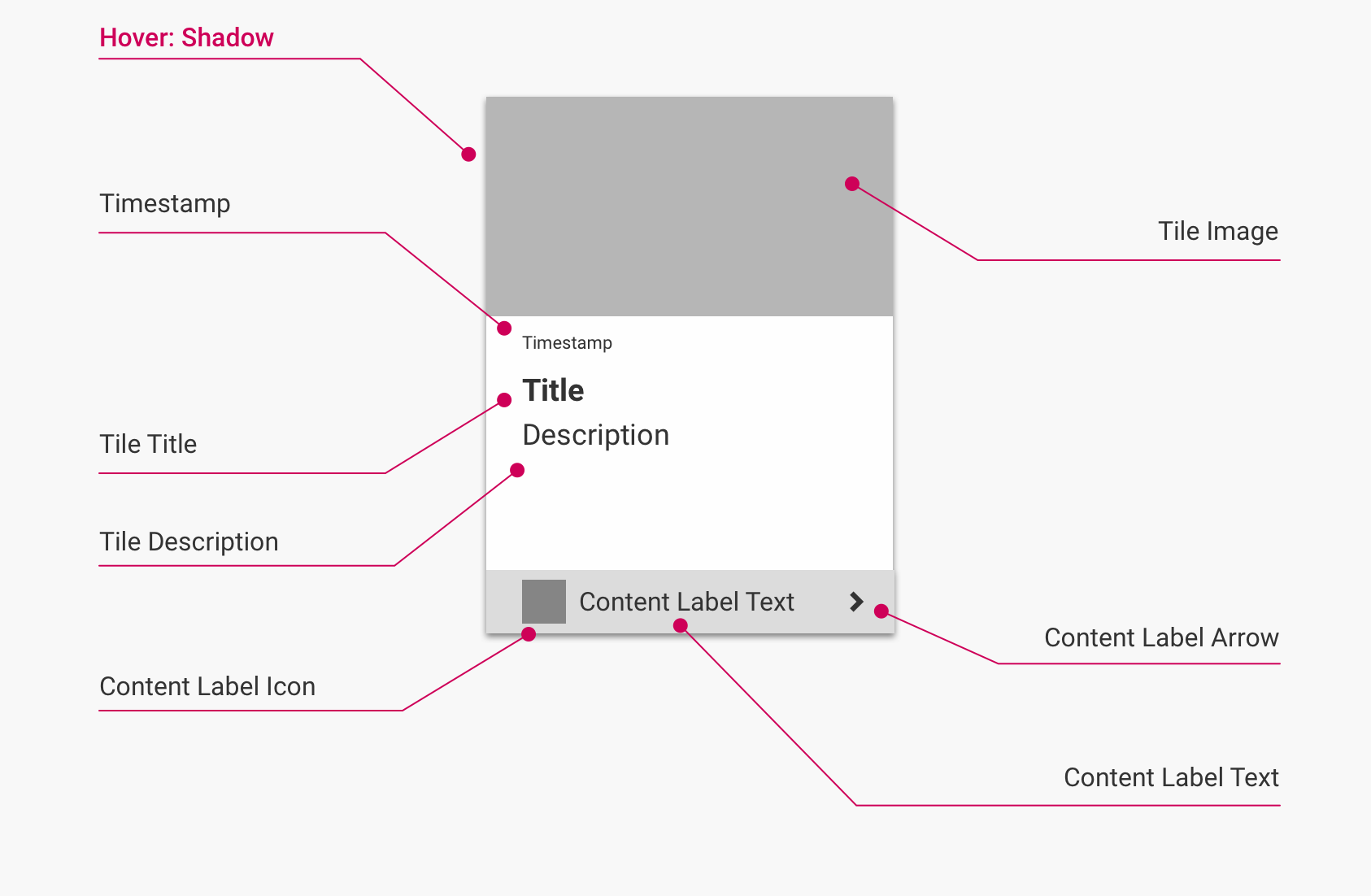
(Click to enlarge)
Elements and CSS selectors
The following table lists the elements found in this component, along with their CSS selectors:
| Element | Container CSS Selector | Element CSS Selector | HTML Element | Notes |
|---|---|---|---|---|
| Tile Wrapper [not labeled] | ul.uf-tile-container | .uf-tile-wrapper | <li> | Acts as the container for the tile. Target this element to style margins and tile sizes. |
| Hover: Shadow | ul.uf-tile-container | .uf-tile-wrapper.uf-highlight-item | <li> | Drop shadow effect added in hover state. Applied to same element as Tile Wrapper by appending class uf-highlight-item. |
| Tile/Item Link [not labeled] | article | .uf-tile | <a> | Use to target the actual tile. Also acts as the link to the item. |
| Tile Image | figure.uf-tile-thumbnail | N/A | <img> | |
| Timestamp | header.uf-tile-copy | .uf-tile-friendly-timestamp | <time> | Timestamp is relative to current date, e.g. "2 days ago". |
| Tile Title | header.uf-tile-copy | .uf-tile-title | <h1> | Set to the title of the Item to which the tile links. |
| Tile Description | header.uf-tile-copy | .uf-tile-description | <p> | If the description exceeds 30 characters, the class uf-hidden is automatically added to hide the additional characters. |
| Content Label Container [not labeled] | a.uf-tile | .uf-tile-content-label | <div> | Contains the Content Label Icon, Text, and Arrow. |
| Content Label Icon | div.uf-tile-content-label | .blogpost .uf-tile-content-label-text:before | <p> | Points to a preset, content-specific icon by default (e.g. fa-rss from Font Awesome for blog articles). Can be deleted by setting content:none. |
| Content Label Text | div.uf-tile-content-label | .uf-tile-content-label-text | <p> | Preset label text is specific to the content type, i.e. "Read Article", "Watch Video", "Read Flipbook", "View Tweet", etc. |
| Content Label Arrow | div.uf-tile-content-label | .uf-tile-content-label-arrow | <i> | Set to the fa-angle-right icon from Font Awesome by default. |
Note
Item tiles actually have two box shadows. In the Static state, there is a box shadow applied to the Tile element (
a.uf-tile). In addition to this, the Hover state adds a second box shadow to the Tile Wrapper element (.uf-tile-wrapper).
Types
Because item tiles represent specific pieces of content, there are variations to account for different types of content. These variations correspond to the major secondary page types for the item page page type (i.e. blog, document, video, and social) and are identified based on specific classes that are added to the Tile element (a.uf-tile).
Blog item tiles
Links to item pages with the Blogpost secondary page type.
Added identifier classes:
blogpostuf-blogs
Document item tiles
Links to item pages with the Document secondary page type.
Added identifier classes:
- General (all document types):
uf-docs - Type-specific:
uberflip,uf-portrait(used for pages with Uberflip Flipbook tertiary page type only)
Notes
- Thumbnails on item tiles for Uberflip (Flipbook) items are in portrait layout, rather than the landscape layout used for all other tile types (SlideShare item tiles use landscape).
- Titles are only shown on a single line, and titles that are too long are cut off with ellipses (...) instead of wrapping to a new line as with all other tile types.
- Descriptions are hidden by default.
Video item tiles
Links to item pages with the Video secondary page type.
Added identifier classes:
- General (all video hosts):
uf-videos - Host-specific:
brightcove,vidyard,vimeo,wistiar,youtube
Notes
- Thumbnails on video item tiles have a play button overlay.
- Descriptions are hidden by default.
Social item tiles
Links to item pages with the Social secondary page type.
Added identifier classes:
- General (all platforms):
uf-social - Platform-specific:
twitter
Notes
- Social item tiles include an avatar and use the account title for the tile title.
Data attributes
Item tiles contain tile data, which provide information about the corresponding content item. This data is added to the Tile Wrapper element (li.uf-tile-wrapper) in the form of data attributes.
The following tile data attributes are available on each item tile:
| Data Attribute | Attribute Value | Description |
|---|---|---|
| Item ID | data-id="XXXXXX" | Refers to the unique hub backend identifier code of the item. |
| Source Stream ID | data-source-stream-id="XXXXXX" | Refers to the unique hub backend identifier code of the stream the item was placed in originally. This is always the original stream ID, even if the item is being viewed in the context of another stream in the front end. |
| Tags | data-tags="XXXXXX,XXXXXX" | Users can add tags to items in the hub backend. If an item has tags, these are provided as a comma-separated list of values using this attribute (see note below). |
Important: Data Tags
The
data-tagsattribute is not present by default. To enable it, turn on the setting Include Item tags for Custom Code in the hub backend under Hubs > Hub Options > Advanced.
Link CTA tiles
Link CTA tiles act as links to custom, user-defined destinations (including content pages). The basic layout of a Link CTA tile consists of a background (solid color or image), a large text tagline, and a button that links to the custom destination. Link CTA tiles have only one state (Static).
Locations
Link CTA tiles have several placement options. Depending on the placement(s) chosen, Link CTA tiles can be found on pages with the hub page, stream page, and item page page types.
Hub and stream page types
On the hub page and stream pages, Link CTA tiles can be placed within the tile grid component, inline with item tiles. Users can define where in the tile grid (after which number of tiles) a Link CTA will appear, and if duplicates will appear at specified intervals of tiles.
Item page types
Link CTA tiles may also be placed on item pages using the Show Beside placement. When this placement is used, the Link CTA tile is placed in the container element div#uf-cta-beside, and will appear in one of two locations depending on viewport size:
- Viewports 1351 px wide or larger: Floating to the right side of the main content wrapper component.
- Viewports 1350 px wide or smaller: Immediately below the main content wrapper component.
The placement can be configured per-tile to either be unique to a particular item, or to apply to every item in a specified stream.
Layout: Static state
This is the default state of the Link CTA tile component after it is loaded on a page.
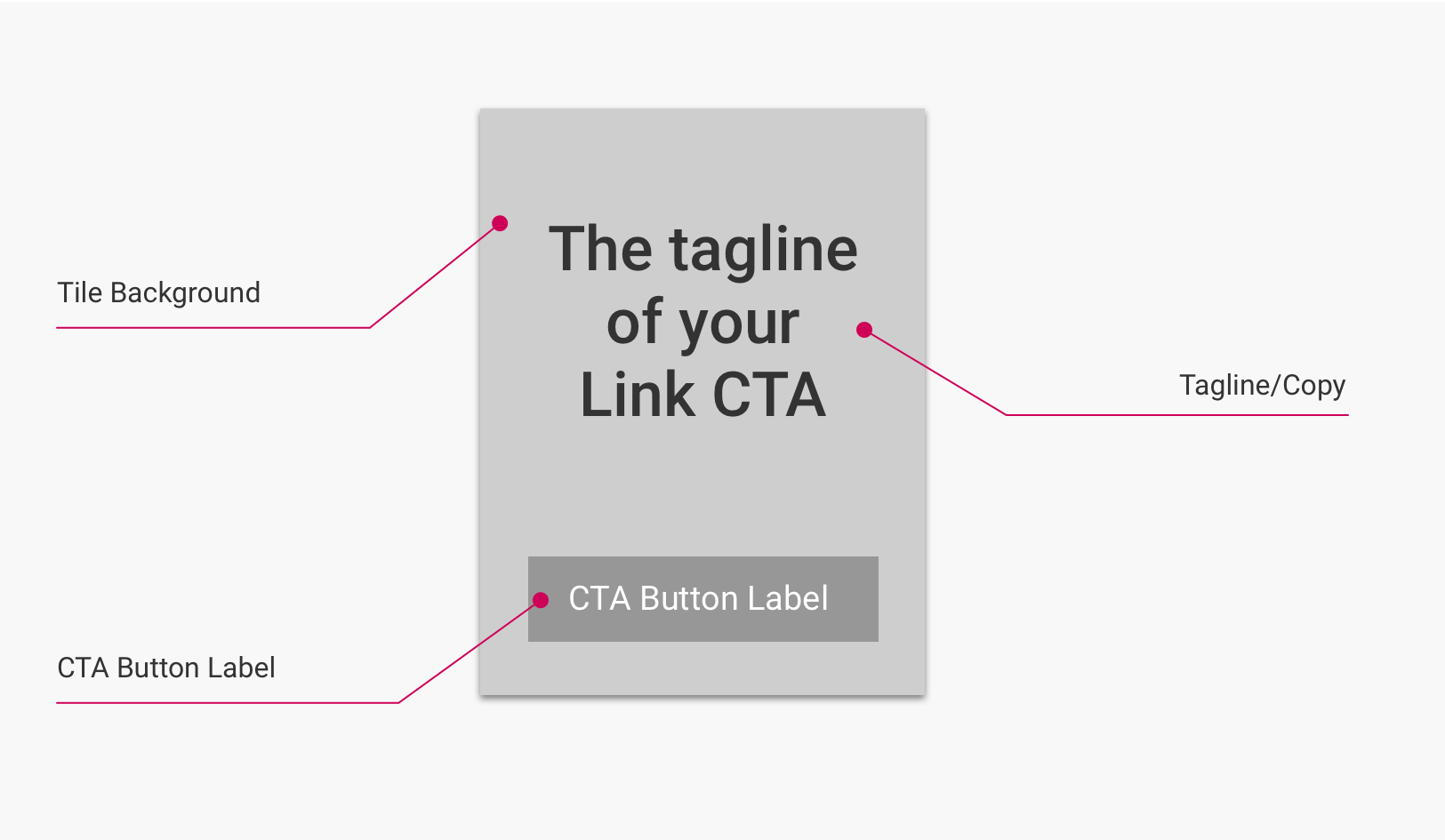
(Click to enlarge)
Elements and CSS selectors
The following table lists the elements found in this component, along with their CSS selectors:
| Element | Container CSS Selector | Element CSS Selector | HTML Element | Notes |
|---|---|---|---|---|
| Tile/Tile Background | ul#uf-tile-container (Tile Grid) or div#uf-cta-beside (Show Beside) | .uf-link-cta-tile | <li> | May be a solid color or image, depending on backend configuration. |
| Tagline/Copy | .uf-link-cta-tile | .uf-link-cta-tile-text | <p> | Tagline text is user-configured in hub backend. |
| CTA Button/Link [not labeled] | .uf-link-cta-tile | .uf-link-cta-tile-link | <a> | Link destination is user-configured in hub backend. |
| CTA Button Label | .uf-link-cta-tile | .uf-link-cta-tile-link:before | <a> | Label text is user-configured in hub backend. |
Data attributes
Link CTA tiles contain tile data, which provide information about the corresponding backend Link CTA. This data is added to the Tile element (.uf-link-cta-tile) in the form of data attributes.
The following tile data attributes are available on each Link CTA tile:
| Data Attribute | Attribute Value | Description |
|---|---|---|
| CTA ID | data-id="XXXXXX" | The unique hub backend identifier code of the Link CTA. |
Form CTA tiles
Form CTA tiles act as forms, allowing visitors to enter information. To collect this information, Form CTA tiles must be connected in the hub backend to an external marketing automation platform, e.g. Oracle Eloqua, Marketo, etc. Once a visitor has submitted a Form CTA, the default behavior is to hide the corresponding Form CTA tile in the hub front end everywhere that it would have previously appeared.
The basic layout of a Link CTA tile consists of a background (solid color or image), a large text tagline, and a button that links to the custom destination. Form CTA tiles are the most complex type of tile, with three states: Static, Focus, and Success.
Locations
Form CTA tiles have several placement options. Depending on the placement(s) chosen, Form CTA tiles can be found on pages with the hub page,stream page, and item page page types.
Hub and Stream page types: Tile Grid
On the hub page and stream pages, Form CTA tiles can be placed within the tile grid component, inline with item tiles. Users can define where in the tile grid (after which number of tiles) a Link CTA will appear, and if duplicates will appear at specified intervals of tiles.
Item page types: Show Beside
On item pages, the first placement option for Form CTA tiles is Show Beside. When this placement is used, the Link CTA tile is placed in the container element div#uf-cta-beside, and will appear in one of two locations depending on viewport size:
- Viewports 1351 px wide or larger: Floating to the right side of the main content wrapper component.
- Viewports 1350 px wide or smaller: Immediately below the main content wrapper component.
Item page types: Gate
For item pages, the other placement option for Form CTA Tiles is Gate. In this placement, the tile is placed in the container element section#uf-gated-cta-wrapper and displayed as an overlay on top of the main content wrapper component. This obscures the content so that visitors must interact with the Form CTA to view it. In this placement, the Form CTA can be configured to either appear immediately on page load, or after a set amount of time.
Both item page placements can be configured per-tile to either be unique to a particular item, or to apply to every item in a specified stream.
Layout: Static state
This is the default state of the Link CTA tile component after it is loaded on a page. In this state, only a single form field is exposed.
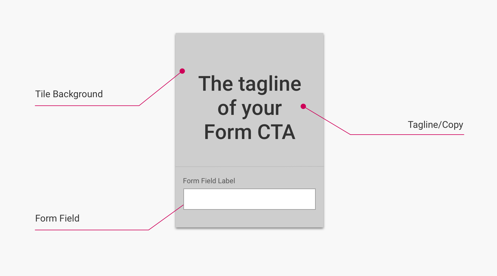
(Click to enlarge)
Important
The initial form field displayed in the Static state is a dummy field: despite being an input element, the dummy field is never filled out, and instead acts as an "activate" button.
When a visitor clicks the dummy field, the CTA makes a function call which retrieves the rest of the inputs from the integrated form. At this point, the initial elements from the Static state scroll up and away, and the Form CTA tile enters the Focus state, in which the actual input elements to be filled out are revealed.
Layout: Focus state
This state occurs when clicking on a Form CTA's single exposed (dummy) form field. In this state, the remaining form fields configured on the Form CTA are exposed.
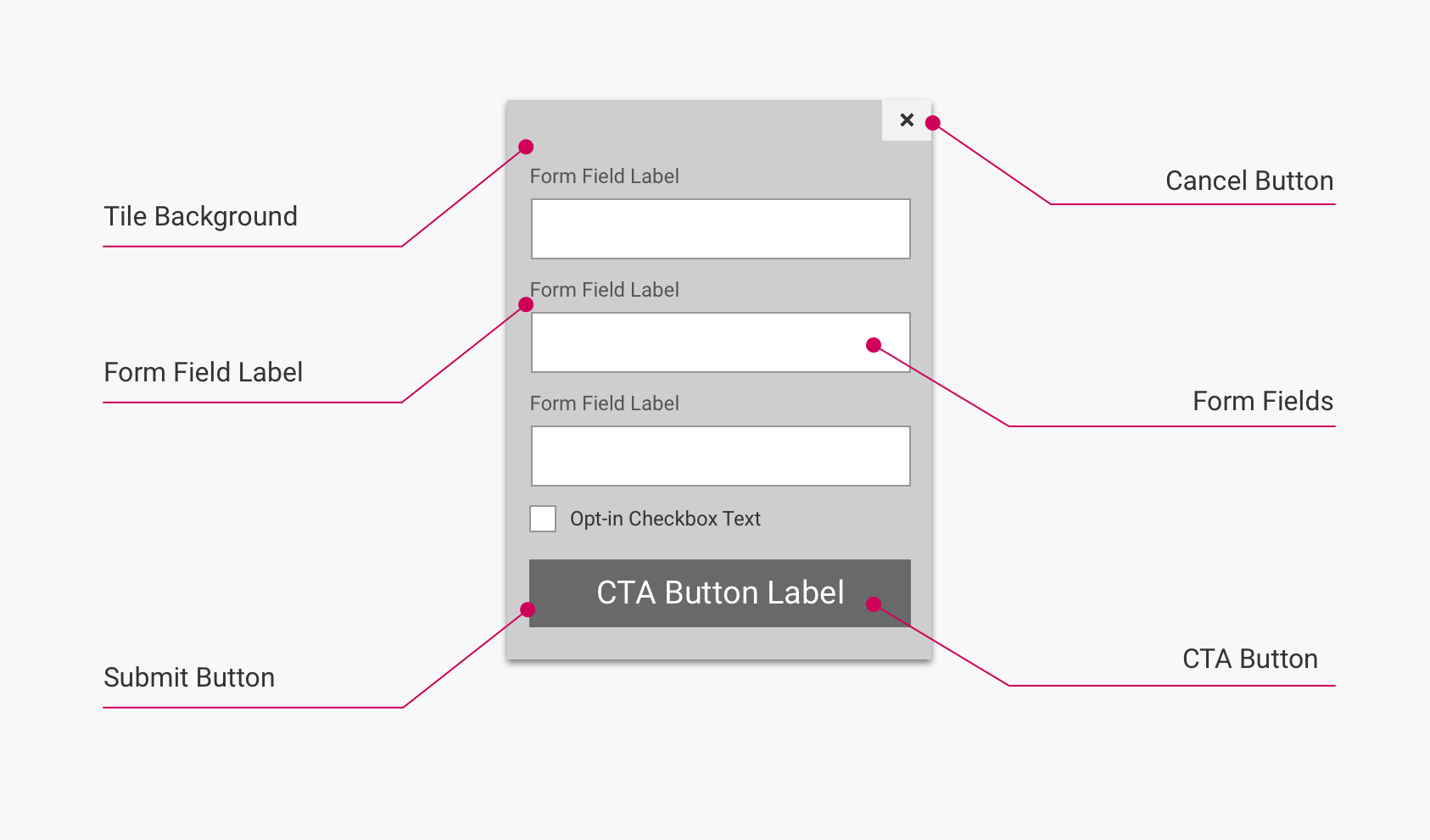
(Click to enlarge)
Layout: Success state
This state occurs when a visitor successfully submits the Form CTA by completing all form fields and clicking the Submit Button element. In this state, a success message is displayed to indicate that the Form CTA was successfully submitted.
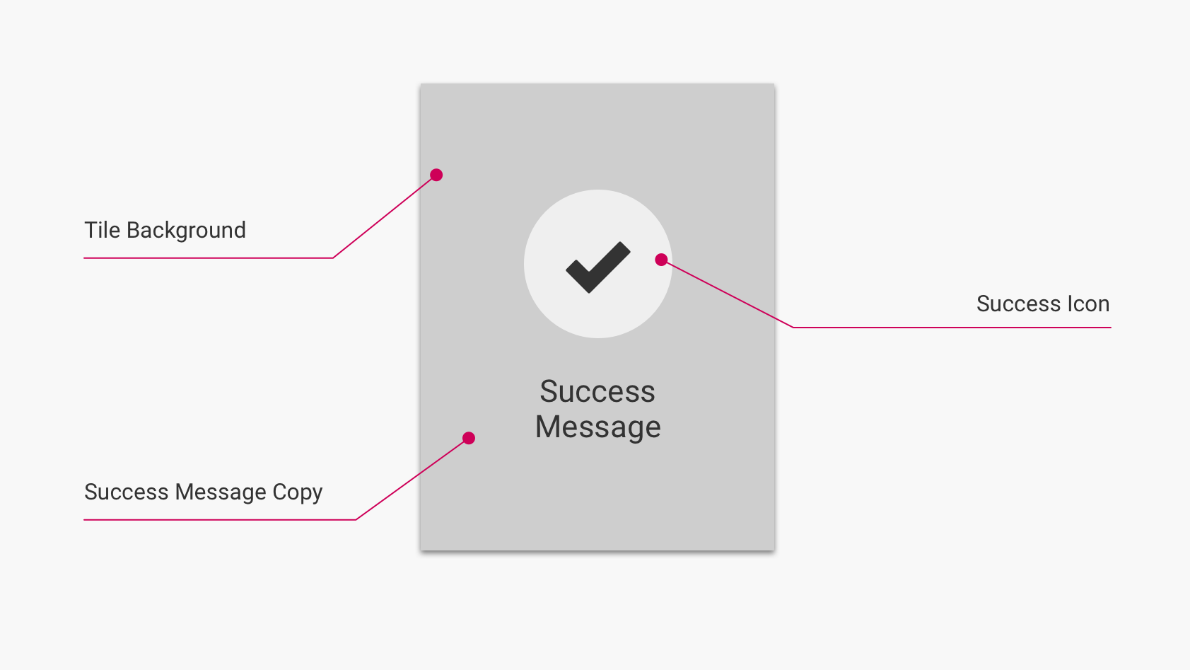
(Click to enlarge)
Note
This state is not used when the Form CTA tile is used with the Gate placement option.
Elements and CSS selectors
The following table lists the elements found in this component, along with their CSS selectors:
| Element | Container CSS Selector | Element CSS Selector | HTML Element | Notes |
|---|---|---|---|---|
| Tile/Tile Background | ul#uf-tile-container (Tile Grid) ordiv#uf-cta-beside (Show Beside) or* section#uf-gated-cta-wrapper (Gate) | .uf-form-cta-tile | <li> | All states. |
| Tagline/Copy | div.uf-cta-landing-panel | .uf-cta-tagline | <p> | Static state only. |
| Form Field (Dummy) | div.uf-cta-activate | .uf-cta-activate-button | <button> | Static state only. |
| Cancel Button | form.uf-cta-activated-panel | .uf-cta-deactivate-button | <button> | Focus state only. |
| Form Field Label | div.uf-cta-field | .uf-cta-label | <label> | Focus state only. |
| Form Field (Actual) | div.control | .uf-cta-input | <input> | Focus state only. |
| Submit Button/Label | div.uf-cta-submit-button | .uf-cta-submit-button | <button> | Focus state only. |
| Success Icon | div.uf-cta-success-panel | .uf-icon-success | <span> | Success state only. |
| Success Message Copy | div.uf-cta-success-panel | .uf-cta-success-copy | <p> | Success state only. |
Note
Each state of the Form CTA tile has a corresponding
<div>element, with the following classes:
- Static state element:
uf-cta-landing-panel- Focus state element:
uf-cta-activated-panel- Success state element:
uf-cta-success-panelBy default, the elements for the Focus and Success states also have a class of
uf-hidden. When a Form CTA tile moves between states, the now-active state's element loses theuf-hiddenclass, while the inactivate states' elements gain/retain it.In addition, when the tile enters any state other than the default Static state, the tile's main container element (
uf-cta-form-tile) gains the classuf-cta-is activated.
Data attributes
Form CTA tiles contain tile data, which provide information about the corresponding backend Form CTA. This data is added to the Tile element (.uf-form-cta-tile) in the form of data attributes.
The following tile data attributes are available on each Link CTA tile:
| Data Attribute | Attribute Value | Description |
|---|---|---|
| CTA ID | data-id="XXXXXX" | The unique hub backend identifier code of the Form CTA. |
Updated over 5 years ago
