Page layout: Functionality pages
A reference guide to the functionality page page types and their page elements
This reference guide describes the layout and composition of pages that are categorized as "functionality pages", which includes the following page types:
Usage
Use this guide to understand which components are used on pages with these page types, how they are laid out, and how to target them for customization.
The diagrams in this guide are representative of the out-of-the-box layouts of pages with these page types. Each diagram is annotated with the page components that are present on the indicated page type (or which may be present, depending on backend settings).
For each page component, the relevant CSS selectors (for both the component itself, and its container) are provided. Wherever a page component is part of a larger page component that has its own reference guide, this is also indicated.
Hub authentication page
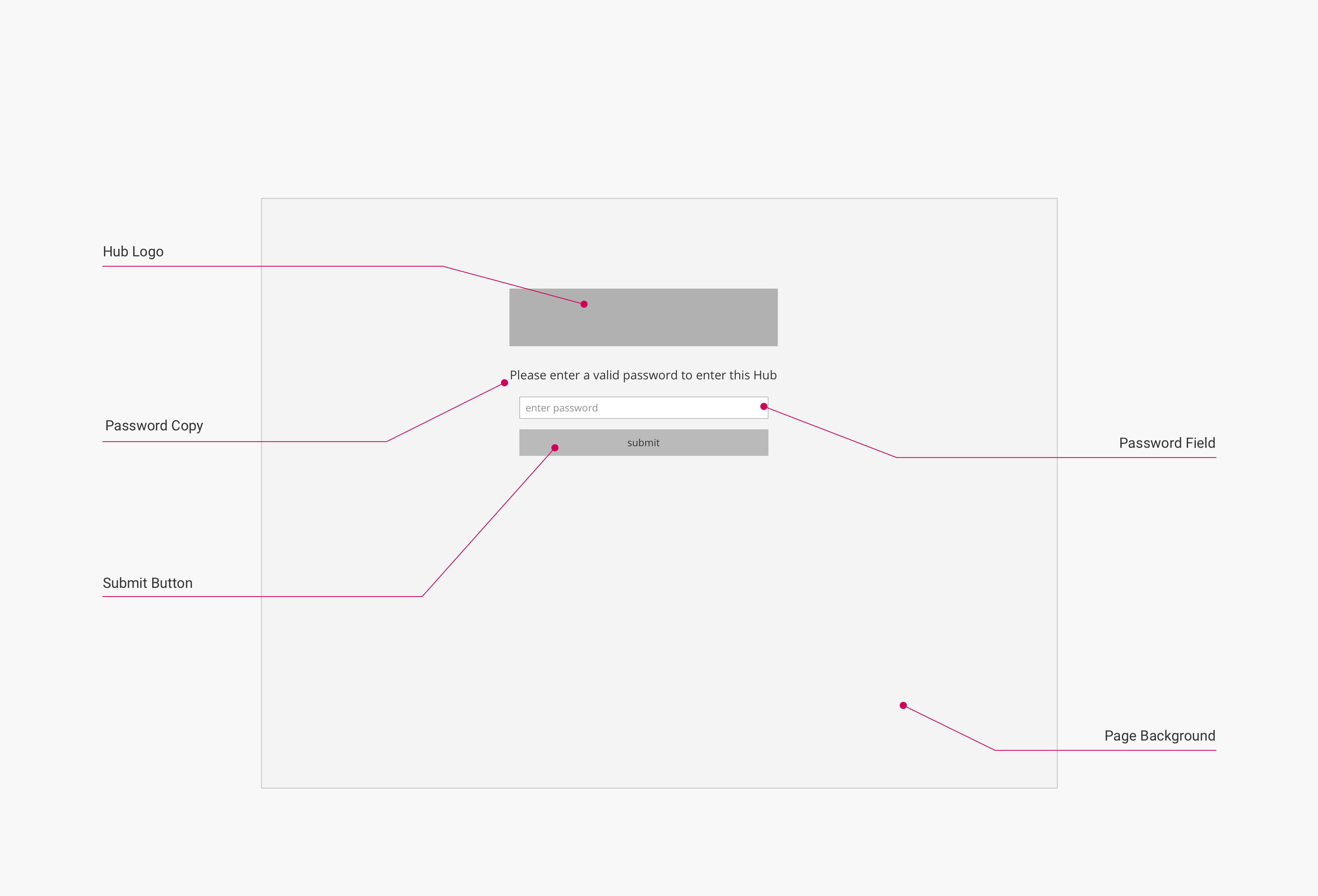
The layout below is used for pages with the hub authentication page page type. This page type is used as the login page for hubs that use hub authentication.
Layout
(Click to enlarge)
Page components and CSS selectors
The following table lists the CSS selectors for the labelled page components in the diagram:
| Page Component | Container CSS Selector | Component CSS Selector | Notes |
|---|---|---|---|
| Hub Logo | .uf-login-header | .hero-logo | |
| Hub Name [not shown] | .uf-authentication | .uf-login-header | Only displayed if no hub logo has been set in the backend. |
| Password Copy | .uf-login-form | .uf-login-instructions | Displays "Please enter a valid password to enter this hub" by default. |
| Password Field | .uf-login-label-float-group | .uf-login-passphrase | |
| Password Field Placeholder Text | .uf-login-label-float-group | .uf-login-field-label | Displays "enter password" by default. |
| Submit Button | .uf-login-fieldset | .uf-login-submit | |
| Page Background | N/A | body.uf-hub-login | Acts as a container for all components above. Displayed centered on the page. |
Important
To customize the hub authentication page, you must enable the option Hubs > Hub Options > Authentication > Login Page Customization > Include Custom Code in the hub backend.
Stream authentication page
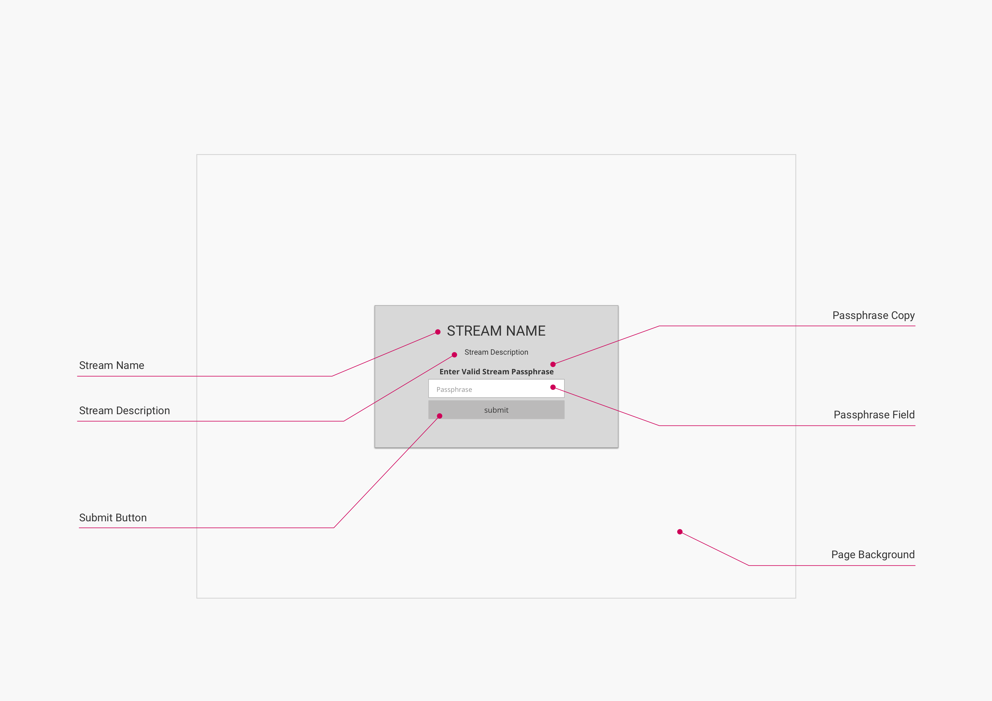
The layout below is used for pages with the stream authentication page page type. This page type is used as the login page for stream pages that use stream authentication.
Layout
(Click to enlarge)
Page components and CSS selectors
The following table lists the CSS selectors for the labelled page components in the diagram:
| Page Component | Container CSS Selector | Component CSS Selector | Notes |
|---|---|---|---|
| Stream Name | .uf-authentication | .uf-login-header | |
| Stream Description | .uf-authentication | .uf-login-description | |
| Passphrase Copy | .uf-login-form | .uf-login-instructions | Displays "Enter Valid Stream Passphrase" by default. |
| Passphrase Field | .uf-login-label-float-group | .uf-login-passphrase | |
| Passphrase Field Placeholder Text | .uf-login-label-float-group | .uf-login-field-label | Displays "Passphrase" by default. |
| Submit Button | .uf-login-fieldset | .uf-login-submit | |
| Page Background | N/A | body.uf-stream-login | Acts as a container for all components above. Displayed centered on the page. |
Author page
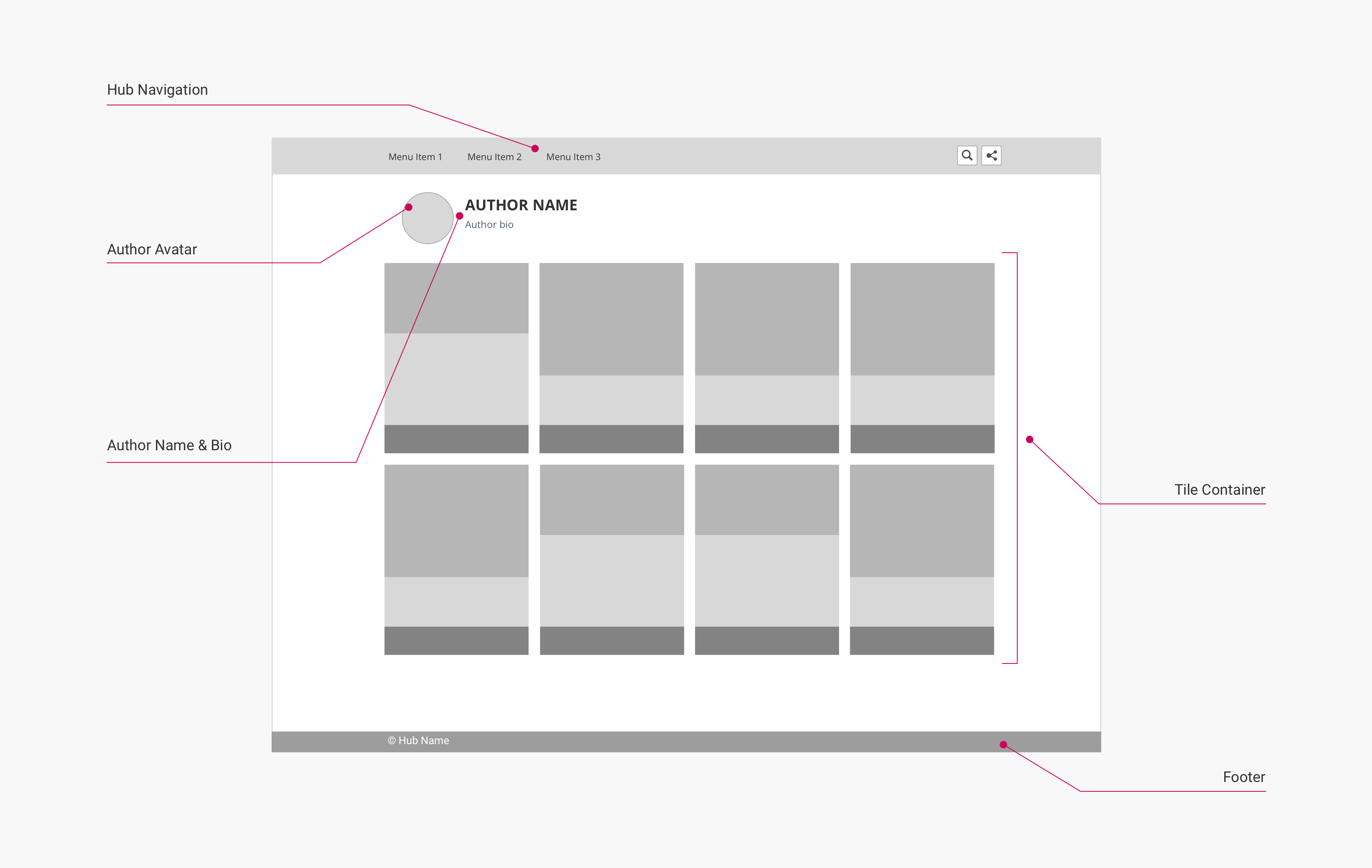
The layout below is used for pages with the author page page type. This page type is used to display a content author's bio and link to content they have authored.
Layout
(Click to enlarge)
Page components and CSS selectors
The following table lists the CSS selectors for the labelled page components in the diagram:
| Page Component | Container CSS Selector | Component CSS Selector | Notes |
|---|---|---|---|
| Hub Navigation | body | .uf-top-nav-container | See Page Component: Hub Navigation for more information. |
| Author Avatar | .uf-author-profile | .uf-author-avatar | Only displayed if author had uploaded a profile picture. |
| Author Name | .uf-author-about | .title | |
| Author Bio | .uf-author-about | .subtitle | |
| Tile Container | .uf-lazy-loader | .uf-tile-container | See Page Component: Tile Grid for more information. |
| Footer | body | .uf-footer |
Search page
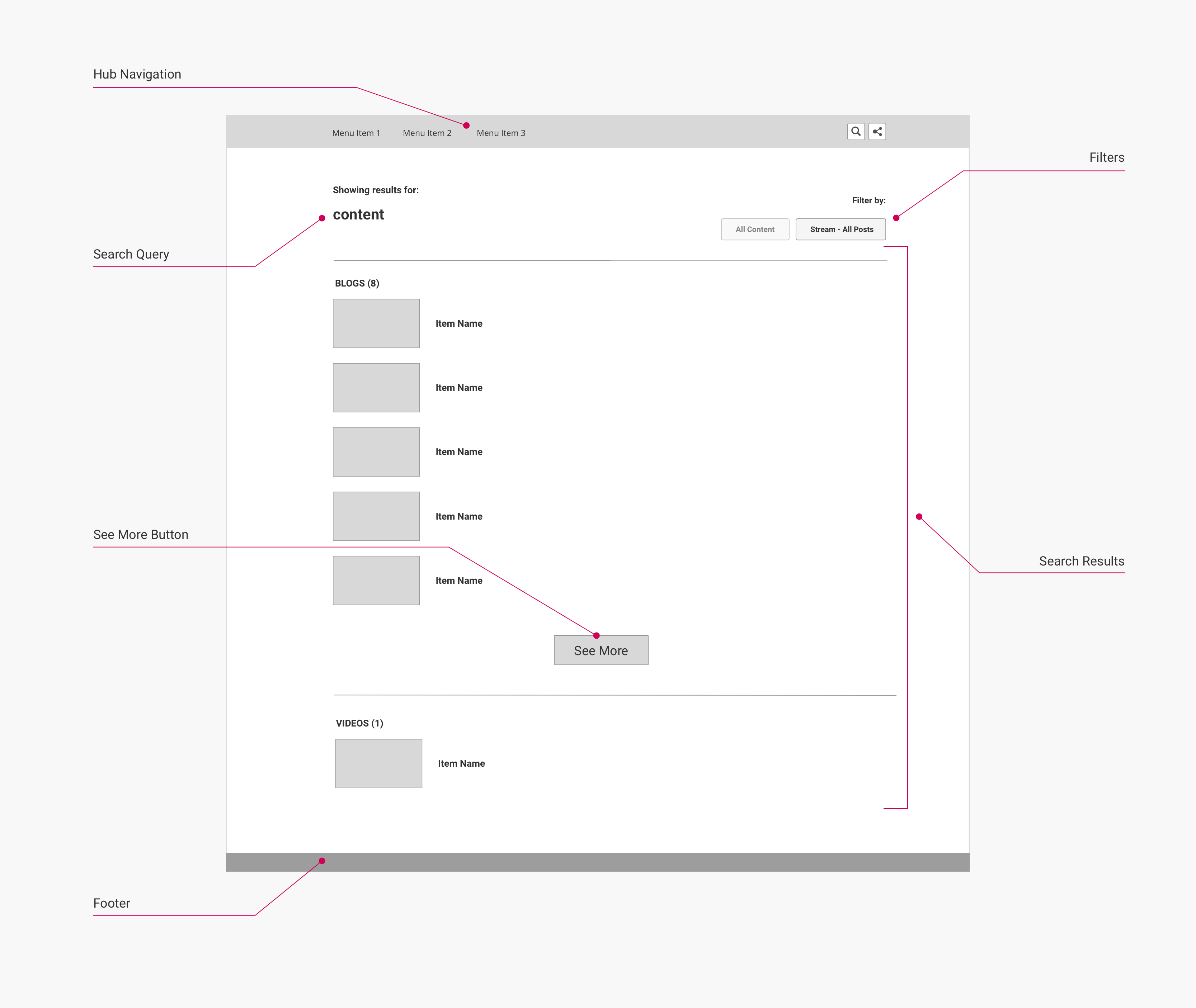
The layout below is used for pages with the search page page type. This page type is used to display search results when the search function built into the hub navigation page component is used.
Layout
This layout is used for pages with the search page page type.
(Click to enlarge)
Page components and CSS selectors
The following table lists the CSS selectors for the labelled page components in the diagram:
| Page Component | Container CSS Selector | Component CSS Selector | Notes |
|---|---|---|---|
| Hub Navigation | body | .uf-top-nav-container | See Page Component: Hub Navigation for more information. |
| Filter Options | .search-results-header | .search-results-filters | Only displayed when the search function is used from a stream page or item page. |
| Search Query | .search-results-header | .search-query | |
| Content Type Heading | .search-results | .title | May be displayed multiple times if search results include multiple content types. |
| Search Result Title | .search-result-link | .search-result-title | |
| Search Results Container | .search-results | .search-results-list | |
| See More Button | .search-results | .uf-button | Only displayed if a section of the search results list contains more than 5 items. |
| Footer | body | .uf-footer |
Privacy page
The layout below is used for pages with the privacy page page type. This page type is used to display a hub's privacy policy and privacy groups settings, if those features are enabled in the hub.
Layout
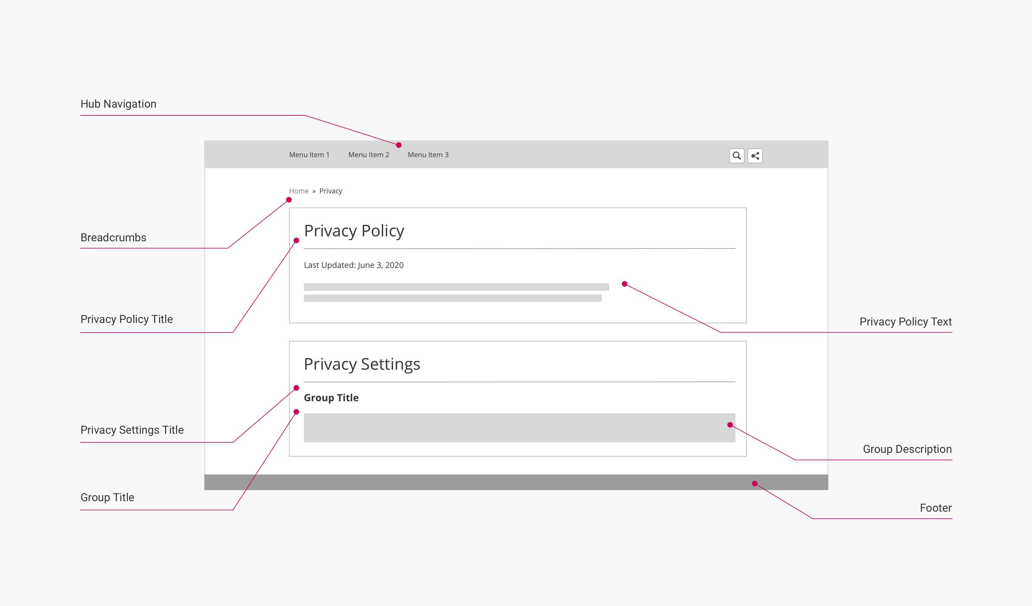
(Click to enlarge)
Page components and CSS selectors
The following table lists the CSS selectors for the labelled page components in the diagram:
| Page Component | Container CSS Selector | Component CSS Selector | Notes |
|---|---|---|---|
| Hub Navigation | body | .uf-top-nav-container | See Page Component: Hub Navigation for more information. |
| Breadcrumbs | .uf-breadcrumbs-container | .uf-breadcrumbs | See Page Component: Breadcrumbs for more information. |
| Privacy Policy Container [not labeled] | .uf-privacy-policy-page | .entry-wrapper | Contains the Privacy Policy Title, Date Updated, and Privacy Policy Text components. |
| Date Updated | div.meta | .privacy-policy-date | Automatically set based on the last update to the Privacy Policy text in the hub backend. |
| Privacy Policy Title & Privacy Settings Title | .uf-article-header | .title | |
| Privacy Policy Text | .uf-privacy-policy | .uf-privacy-entry-content | Displays the Privacy Policy, if set. |
| Group Title | .uf-privacy-group-info | .uf-privacy-group-title | May be displayed multiple times if multiple Privacy Groups are configured. |
| Group Description | .uf-privacy-group-info | .uf-privacy-group-description | May be displayed multiple times if multiple Privacy Groups are configured. |
| Group Toggle | .uf-privacy-group-toggle | .uf-checkbox-toggle | May be displayed multiple times if multiple Privacy Groups are configured. |
| Footer | body | .uf-footer |
Updated over 5 years ago
