Page component: Hub navigation
A reference guide to the hub navigation menu component that appears on the majority of hub front end pages
This reference guide describes the hub navigation component. This component appears at the top of all hub front end pages by default (except those related to sales streams).
Usage
Use this guide to understand how this component works, how its individual elements are structured, and how to target them for customization.
The diagrams in this guide are representative of the out-of-the-box appearance of the hub navigation page component in its various states. Each diagram is annotated with the constituent elements of this page component, as well as the relevant CSS selectors (for both the element itself, and its container).
About hub navigation
The hub navigation component is a menu bar that allows for navigation between the various stream pages that are present in the hub front end. On page types where this component is displayed, it is aligned to the top of the page.
The component consists of three primary elements displayed in the menu bar, from left to right:
- Menu Items: Parent menu items that each display a dropdown on hover containing hyperlinks to stream pages.
- Search Button: Button that expands a search field on click.
- Share Button: Button that displays a dropdown with social sharing options on hover.
Collectively, these elements are contained in a div with id="uf-top-nav-container".
Layouts
This component has two layouts, desktop and mobile, with a breakpoint at 1337 px. The component uses the same HTML elements, element selectors and CSS for both layouts.
-
Desktop layout: In this layout, the container for this component stretches to fit the full width of the page. The constituent elements are in a container that is set to a smaller width, and is centered on the page. Within this container, the menu items are aligned to the left side of the component, and the search and social share buttons are aligned to the right side. The same container width is also used for other page components (e.g. tile grid, footer), so by default components like hub navigation, tile grid, and footer align.
-
Mobile layout: In this layout, the menu items are replaced by a menu button. On activation, the menu button displays a panel that contains the menu items. The panel is aligned to the left of the viewport, and has a
max-widthof 360 px. On viewports smaller than 360 px, the panel will fit the width of the screen instead.
Menu items
By default, the menu items are automatically generated. The default parent menu items are categories representing specific types of content (i.e. "Blogs", "Social", "Video", etc.). On activation (hover on desktop, tap on mobile) each parent menu item displays a dropdown. The dropdown contains hyperlinks to all non-hidden stream pages with the parent menu's content type. By default, both the parent menu items and the stream hyperlinks they contain are automatically created and updated when streams are added, removed, or hidden in the hub backend.
Typically, users opt to create a custom menu instead of using the auto-generated default menu. In this case, neither the parent menu items nor the items in their dropdowns are automatically created. Instead, these must be created and updated manually. This option is configured in the hub backend under Hubs > Appearance > Menu > Menu Settings > Custom. The behavior of a custom menu is the same as the default menu.
Search button
The hub front end has built-in search functionality. By default, the search bar is collapsed, and expands when the search button is clicked. If a visitor has previously used the search function, expanding the search bar also displays a list of recent search terms.
Share button
Hovering on the share button expands a box that displays social sharing options that visitors can use to share the current page. Available options are: Twitter, Facebook, LinkedIn, and email. These options are configured and enabled/disabled in the hub backend under Hubs > Hub Options > Sharing.
State: Static
This is the default state of the hub navigation component after it is loaded on a page.
Desktop layout
This layout is used for viewports 1337 px wide or larger:

(Click to enlarge)
Mobile layout
This layout is used for viewports 1336 px wide or smaller:
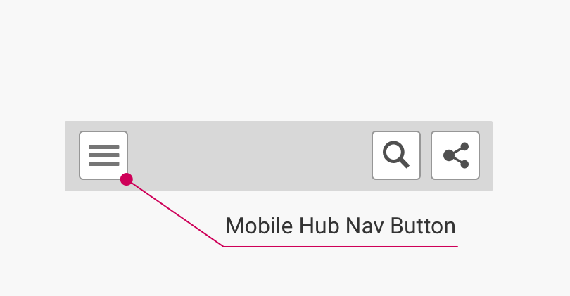
(Click to enlarge)
Component elements and CSS selectors
The following table lists the CSS selectors for the labelled component elements in the diagrams:
| Element | Container CSS Selector | Element CSS Selector | HTML Element | Notes |
|---|---|---|---|---|
| Hub Menu Nav Items | ul#uf-navbar-menu | .navbar-item.uf-menu-parent-list-item | <li> | Applies to both desktop and mobile layouts. The number of these elements corresponds to the number of menu items. On mobile, displayed within the Mobile Menu Panel (see below) when the Mobile Hub Nav Button is activated. |
| Mobile Hub Nav Button | div.navbar-brand | .navbar-burger | <button> | Mobile layout only, displayed in place of the Hub Menu Nav Items. |
| Search Button | div.uf-dropdown-trigger | .uf-search-open | <button> | Applies to both desktop and mobile layouts. |
| Social Share Button | div.uf-dropdown-trigger | #uf-share-icon | <button> | Applies to both desktop and mobile layouts. |
State: Menu item hover/mobile expanded
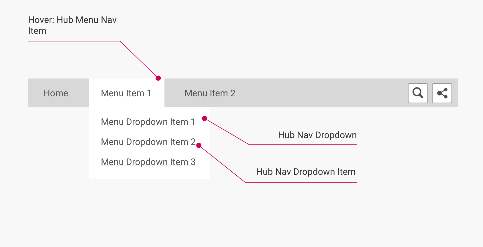
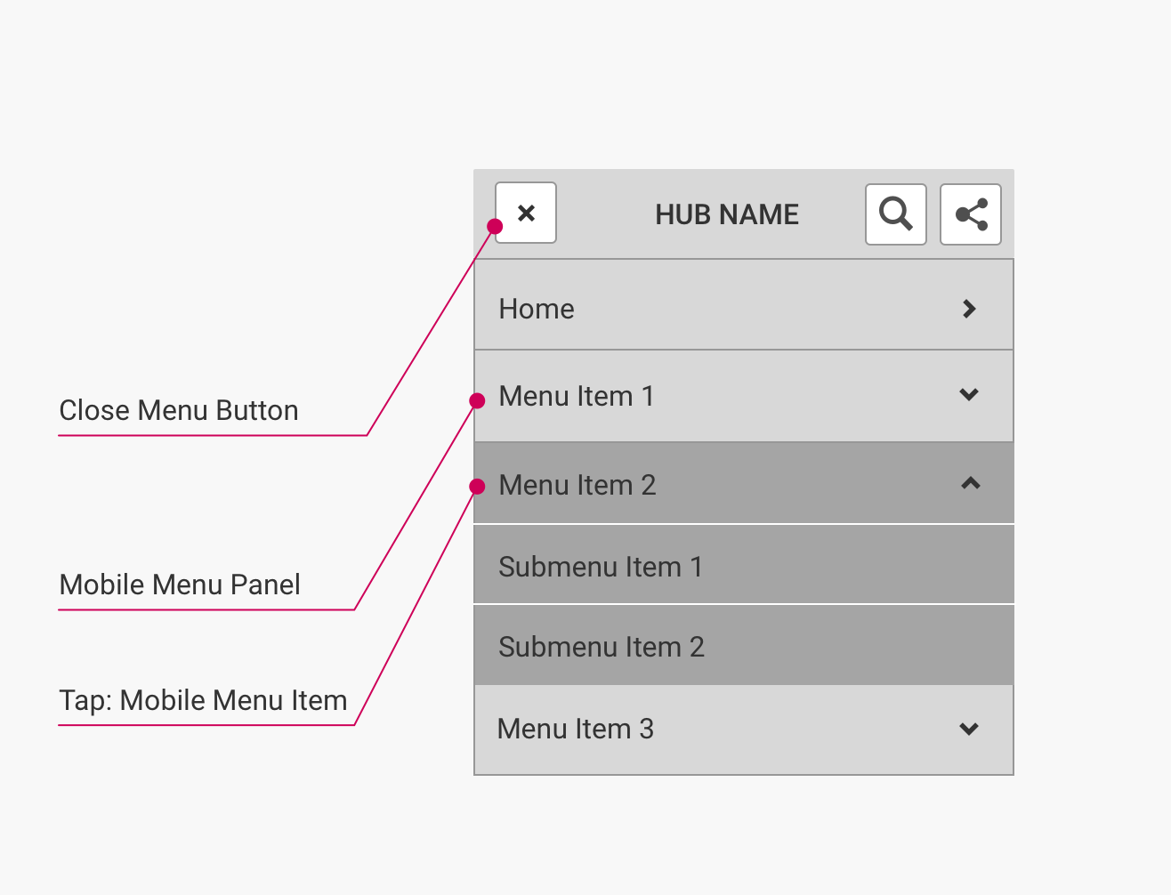
These states occur when a visitor hovers on a Hub Menu Nav Item element (desktop) or activates the Mobile Hub Nav Button element (mobile). In both cases, the state exposes a dropdown/panel with further options.
Desktop layout
This layout is used for viewports 1337 px wide or larger:
(Click to enlarge)
Mobile layout
This layout is used for viewports 1336 px wide or smaller:
(Click to enlarge)
Component elements and CSS selectors
The following table lists the CSS selectors for the labelled component elements in the diagrams:
| Element | Container CSS Selector | Element CSS Selector | HTML Element | Notes |
|---|---|---|---|---|
| Hover: Hub Menu Nav Item | ul#uf-navbar-menu | .navbar-item.uf-menu-parent-list-item.is-hovered | <li> | Desktop layout only. Adds class is-hovered |
| Hub Nav Dropdown | li.uf-menu-parent-list-item | ul.uf-menu-submenu.navbar-dropdown | <ul> | Desktop layout only. Displayed on hover of a Hub Menu Nav Item. Contains Hub Nav Dropdown Items. |
| Hub Nav Dropdown/Submenu Item | ul.uf-menu-submenu.navbar-dropdown | .uf-menu-submenu-list-item | <li> | Deskop and mobile layouts (shown as Submenu Item 1/2 in mobile layout diagram). Each Hub Nav Dropdown Item is a hyperlink to a stream page. |
| Close Menu Button | div.uf-menu-background | .navbar-burger.is-active | <button> | Mobile layout only. Replaces the Mobile Hub Nav Button when the Mobile Menu Panel is active. |
| Mobile Menu Panel | nav#uf-hub-nav | #uf-navbar-menu | <ul> | Mobile layout only. Displays the Hub Menu Nav Items visible by default in the desktop layout. |
| Tap: Mobile Menu Item | ul#uf-navbar-menu | .uf-menu-parent-list-item.uf-nav-is-open | <li> | Mobile layout only. Expands when the Mobile Hub Nav Button is activated. Same underlying element as Hub Menu Nav Item, with uf-nav-is-open class added. |
Note
On desktop, Hub Menu Nav Item elements have window hover events. When hovering over a Hub Menu Nav Item, this adds a classname of
.is-hoveredto the<li>element. This only applies to the parent menu items, not theMenu Dropdown Itemelements in their dropdowns.When targeting elements in their hover state with CSS, make sure to also target
.is-hoveredin addition to the:hoverpseudo-class.
Note
By default, an underline is shown on hover for all
<a>elements within Hub Menu Nav Items and Hub Nav Dropdown Items. This does not apply to the Hub Share Icons in the Hub Share Container (see State: Share Hover below).
State: Active page
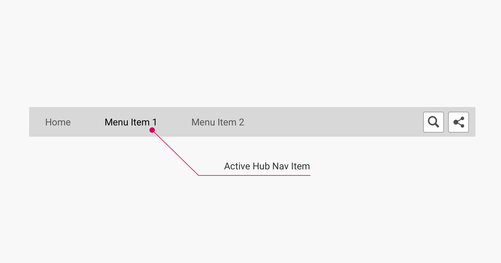
This state occurs on any page in the hub that is accessible from the hub navigation menu items. This includes the hub home page (if a home menu item is present), stream pages listed in the hub navigation menu items, as well as item pages in those streams. In this state, the (parent) Hub Menu Nav Item and the (child) Hub Nav Dropdown Item corresponding to the current page are highlighted.
Desktop layout
This layout is used for viewports 1337 px wide or larger (there is no mobile equivalent layout):
(Click to enlarge)
Component elements and CSS selectors
The following table lists the CSS selectors for the labelled component elements in the diagrams:
| Element | Container CSS Selector | Element CSS Selector | HTML Element | Notes |
|---|---|---|---|---|
| Active Hub Nav Item | ul#uf-navbar-menu | .navbar-item.uf-menu-parent-list-item.uf-selected | <li> | Same as Hub Menu Nav Item, with the class uf-selected added. |
| Active Hub Nav Dropdown/Submenu Item | ul.uf-menu-submenu.navbar-dropdown | .uf-menu-submenu-list-item.uf-selected.uf-selected-child | <li> | Same as Hub Nav Dropdown/Submenu Item, with the classes uf-selected and uf-selected-child added. |
State: Search expanded
This state occurs when clicking on the Search Button element. In this state, the Search Button element is replaced with the Search Field element, allowing visitors to input search terms. If a search history is present in cache for a visitor, a Recent Search Container is also displayed.
Desktop layout
This layout is used for viewports 1337 px wide or larger:
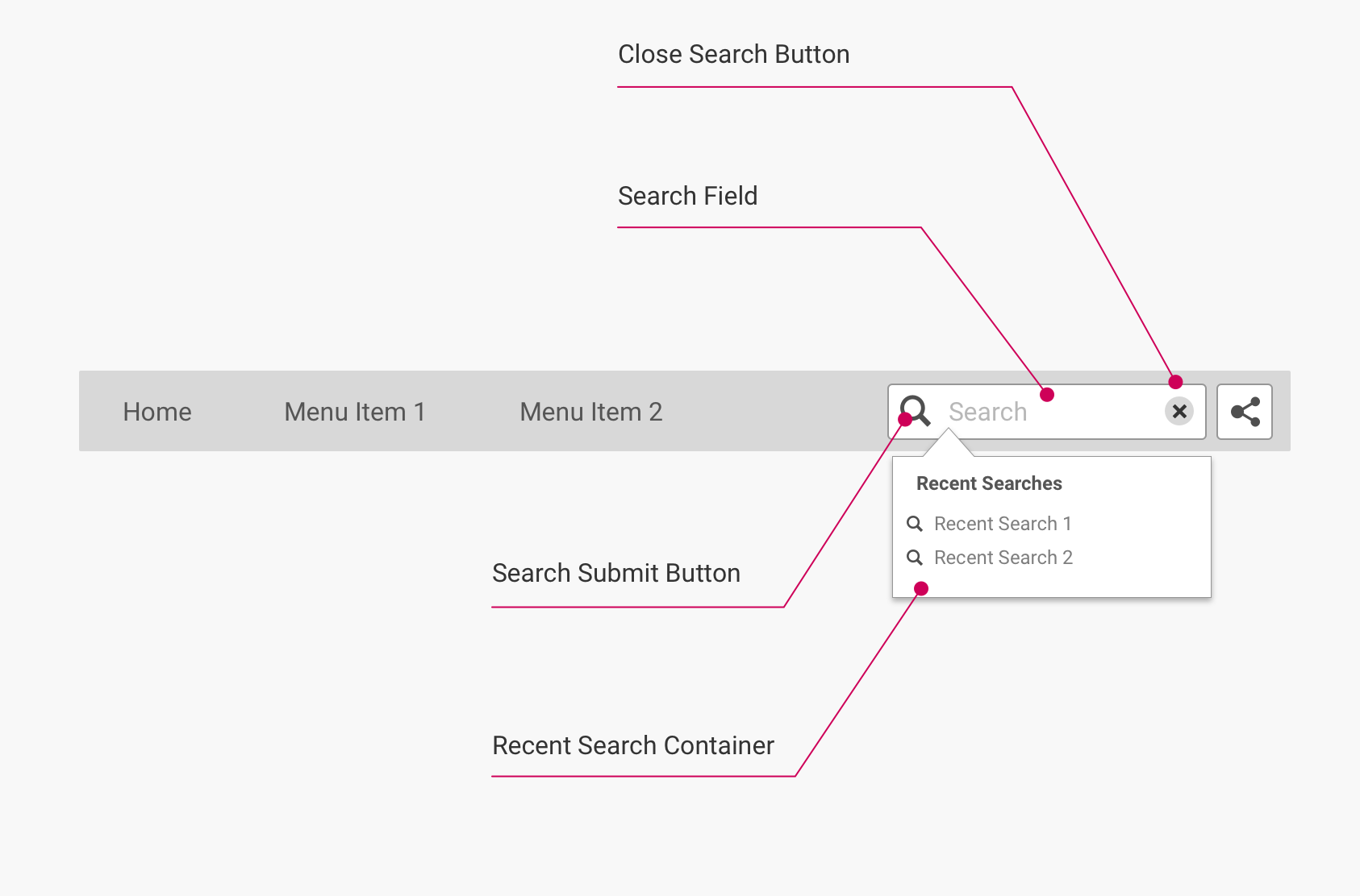
(Click to enlarge)
Note: Expanded search
When the search element is expanded, the class
uf-search-is-expandedis added to thedivwithid="uf-top-nav-container"(i.e. the Hub Navigation component container). This added class handles the styling of the expanded search element, and has the following additional effects:
- On viewports 1337 px wide or larger: The Hub Menu Nav Item elements to the left of the search element are "grayed out" (but not the Share Button element).
- On viewports 1336 px wide or smaller: The Search Field element expands to fit the width of the page, hiding all other elements present (i.e. Mobile Hub Nav Button and Social Share Button). Additionally, the Search Submit and Close Search buttons that appear at the left and right edges of the Search Field element are moved outside the borders of the search field itself.
Additionally, all elements displayed in both layouts when search is expanded are contained within
div#uf-search-dropdown-menu.
Component elements and CSS selectors
The following table lists the CSS selectors for the labelled component elements in the diagrams:
| Element | Container CSS Selector | Element CSS Selector | HTML Element | Notes |
|---|---|---|---|---|
| Search Field | form#uf-search-form | #uf-search-input | <input> | By default, contains the placeholder "Search". |
| Search Submit Button | form#uf-search-form | #uf-search-submit | <button> | |
| Close Search Button | form#uf-search-form | #uf-search-close | <button> | Returns the search element to the default (unexpanded) state. |
| Recent Search Container | form#uf-search-form | #uf-recent-searches | <aside> | Only appears when visitor has previous searches in cache. |
State: Share hover
This state occurs when hovering on the Share Button element. In this state, a dropdown is displayed that contains configurable social sharing options.
Layout
This layout is used for all viewport sizes:
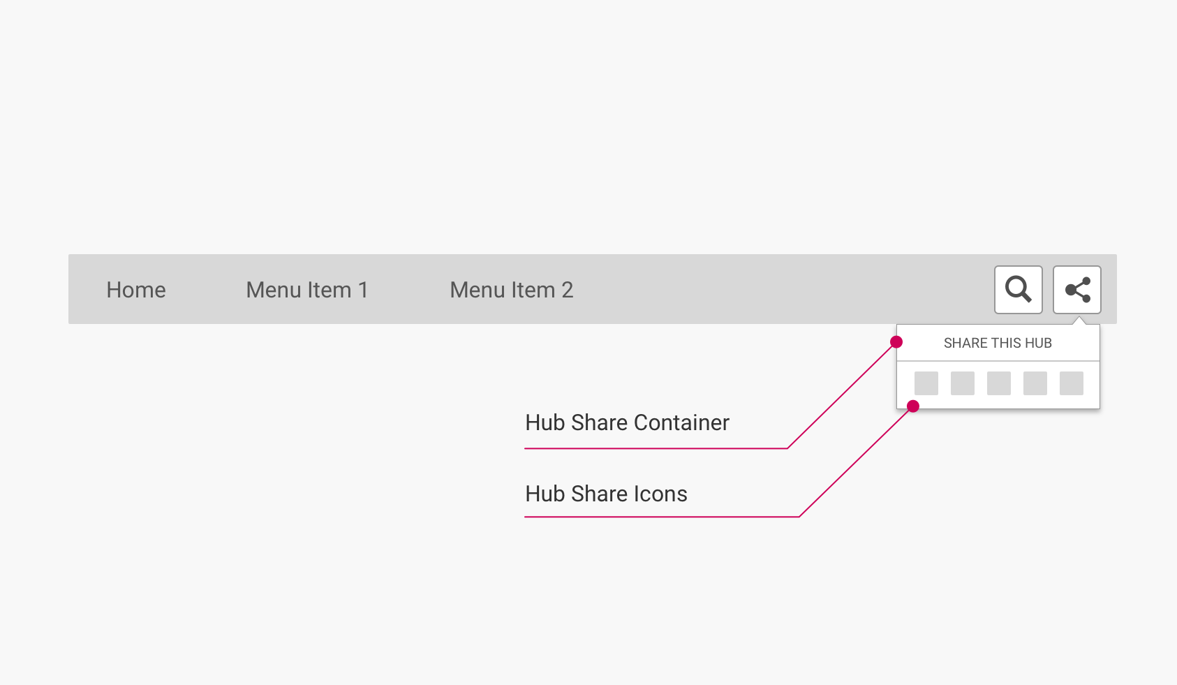
(Click to expand)
Component elements and CSS selectors
The following table lists the CSS selectors for the labelled component elements in the diagrams:
| Element | Container CSS Selector | Element CSS Selector | HTML Element | Notes |
|---|---|---|---|---|
| Hub Share Container | aside#uf-social-share | #uf-dropdown-menu | <div> | Depending on context, contains an h2 with the text "Share This Hub", "Share This Stream", or "Share This Item". |
| Hub Share Icons | div#uf-dropdown-menu | .uf-dropdown-item | <li> | Icons for sharing options are not displayed if disabled in the hub backend. |
Updated over 5 years ago
